BRIDUS - BridgeUp Design System
Design Systems | Contribution and Maintenance Guidelines
INTRODUCTION
About this project
Bridgeup creates opportunities for businesses to raise money in a unique way by monetizing their monthly or quarterly subscriptions for their annual value, directly through its trading platform. In 2022, Bridgeup was already a huge product with more than 15 million Assets Under Management.
Context
As the Design team grew, it became crucial to systemize all components to scale the product consistently. We decided to build a Design System to help designers, PMs and developers communicate with each other in order to build consistent high-quality solutions faster.
Contribution
Product Designer (Me) + Product Manager + Engineering Manager
THE MOTIVATION
Introduction
From the color system and typography to buttons, inputs, and dropdowns — we built the system step by step. Since I was passionate about product consistency, I led this initiative and managed the implementation of the Design System into production and laid out best practices for contribution and maintenance of this system going forward.
“Here’s the simple truth: you can’t innovate on products without first innovating the way you build them.”
—Alex Schleifer, VP of Design at Airbnb
DESIGN FOUNDATIONS
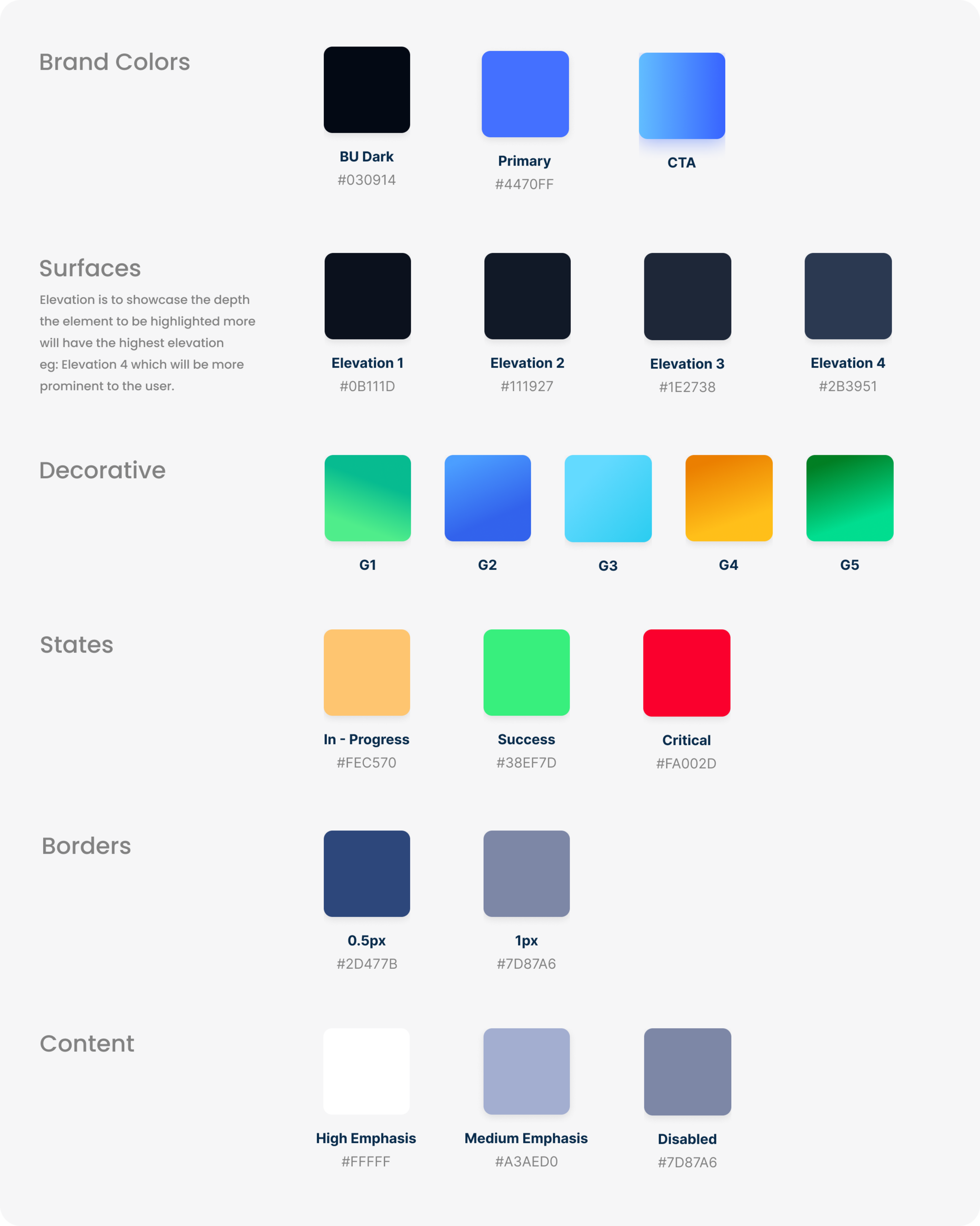
Colors
We chose to go for a dark theme, as it reduce the luminance emitted by device screens, while still meeting minimum color contrast ratios. They help improve visual ergonomics by reducing eye strain, adjusting brightness to current lighting conditions, and facilitating screen use in dark environments – all while conserving battery power.
PRINCIPLES
Communication is key
Color supports the purpose of the content, communicating things like hierarchy of information, interactive states, and the difference between distinct elements.
Darken with grey
Dark grey surfaces can express a wider range of color, elevation, and depth, because it's easier to see shadows on grey (instead of black).
Colors follow accessibility guidelines
Primary colors are desaturated so they pass the Web Content Accessibility Guidelines’ (WCAG) AA standard of at least 4.5:1 (when used with body text) at all elevation levels. This makes things easier to find, identify, and interact with. It also makes the whole experience more accessible for users who are color blind or who have low vision.
Color system in action
Let's get an in-depth understanding of how these colors are labeled and used
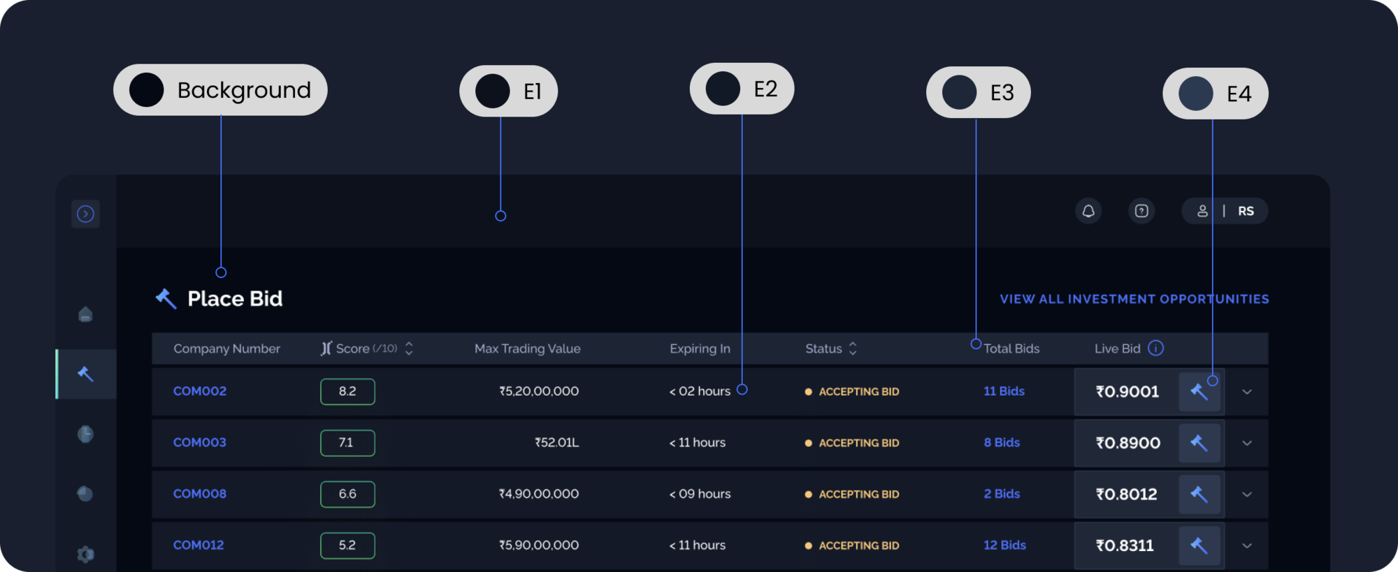
Understanding hierarchy through elevation
The higher a surface's elevation (raising it closer to an implied light source), the lighter that surface becomes. Following the dark theme material design guidelines, we have derived multiple elevation colors via overlays. See below image for better clarity on the concept.
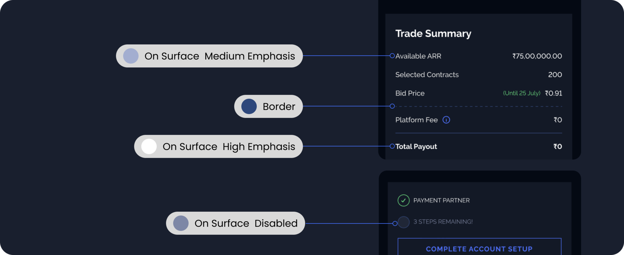
ON SURFACE
Apply on-surface colors to elements that appear on surfaces, usually borders, secondary icons, and text elements.
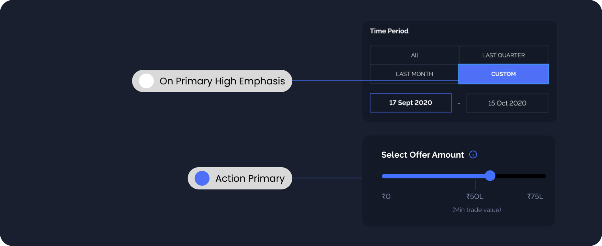
PRIMARY
Use primary colors for primary actions like buttons, icons and text on navigation and tabs.
SUCCESS
Success colors indicate something positive, like the success/probability of winning a bidding action or to illustrate progression.

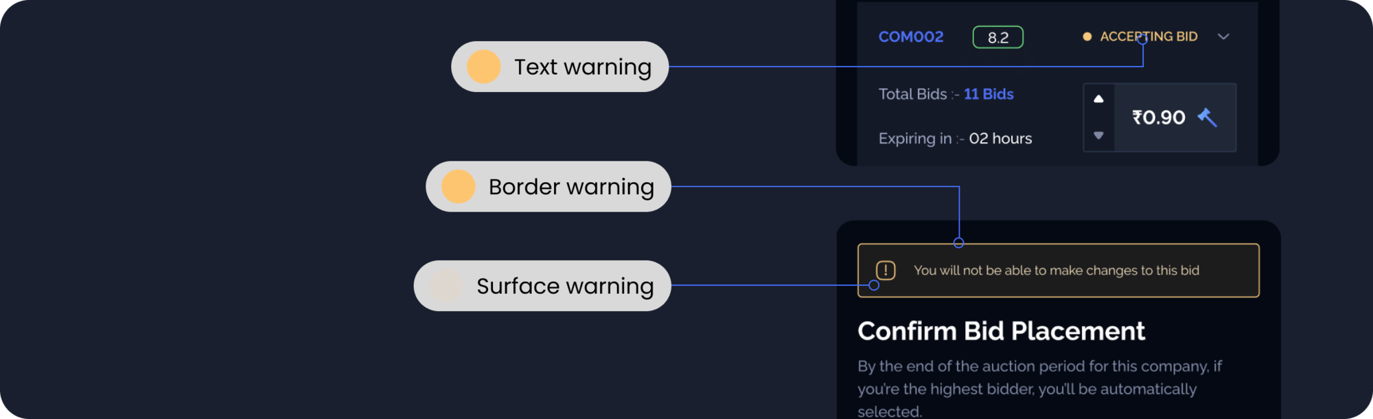
WARNING
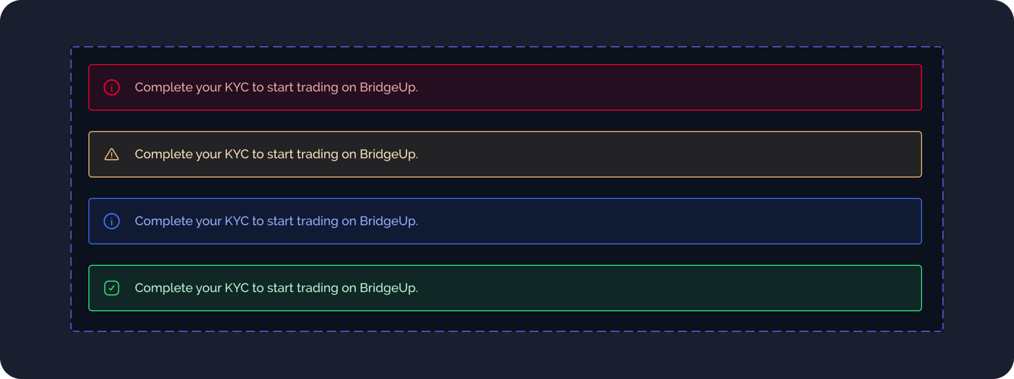
Warning colors let the user know they need to take action, and are applied to badges, banners, and toast messages.
CRITICAL
Critical colors are for destructive interactive elements, errors, and critical events that require immediate action.

DECORATIVE
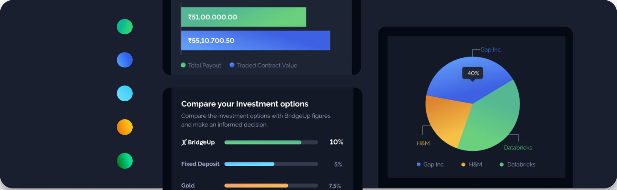
Decorative gradients are for graphs and charts and to expressive communications that assert the brand’s visual identity
DESIGN FOUNDATIONS
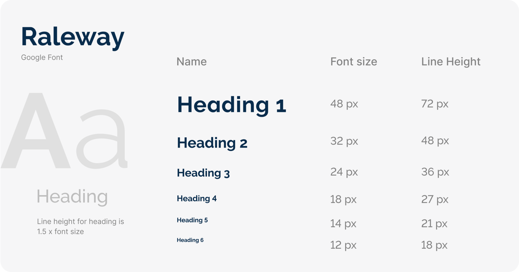
Typography
Typography creates purposeful texture, guiding users to read and understand the hierarchy of information. The right typographic treatment and the controlled usage of type styles helps manage the display of content, keeping it useful, simple, and effective.
PRINCIPLES
Consistency is key
A disciplined consistency with how you size and style type makes the whole experience more intuitive to use. Users who learn how to navigate one experience can apply that same knowledge to each new experience they come across.
Design for all
To enhance accessibility amongst audiences with different eyesight constraints, across different browsers, and different mobile devices, design in a manner that works for all users.
Formatting
Left aligned
The higher a surface's elevation (raising it closer to an implied light source), the lighter that surface becomes. Following the dark theme material design guidelines, we have derived multiple elevation colors via overlays. See below image for better clarity on the concept.
Strong
Should be used cautiously only where there is a requirement of a strong emphasis.

Subdued
The subdued style helps to de-emphasize content, and can be used across all font sizes. Should be used for text that’s non-actionable or less important.

Display styles
Page Heading
Only used for the title of a screen.
Heading
Heading should always be used for titles of top-level sections of a screen. If the sections of a screen are represented by cards, each card’s title should use the Heading style.

Sub-Heading
If a top-level section of a screen has subsections, use the Subheading style for titling those subsections.
Caption
Often used in data visualization, caption is for providing details in places where content is compact and space is tight.
DESIGN FOUNDATIONS
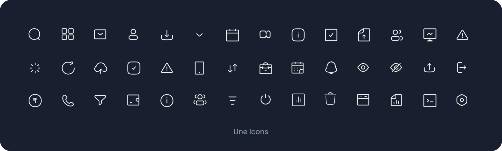
Iconography
Icons should be used in a purposeful manner to maximize comprehension and reduce cognitive load when you need to call attention to a particular action, command, or section. Use them infrequently – if you’re questioning an icon’s use, it probably doesn’t need to be used at all. They’re simple, informative, and build on the visual language of the design system.
PRINCIPLES
Less is more
Detailed icons increase cognitive load. Focus on simplicity to help users understand the concept the icon represents and recognize icons on smaller screens.
Meaningful choices
Prefer symbols that represent the most basic idea or concept instead of a metaphorical one. If the concept can’t be conveyed literally (an activity like gardening, a profession like doctor), pick a logically related symbol (shovel, stethoscope).
Function over looks
Focus on the effectiveness of the message instead of its ability to delight.
DESIGN FOUNDATIONS
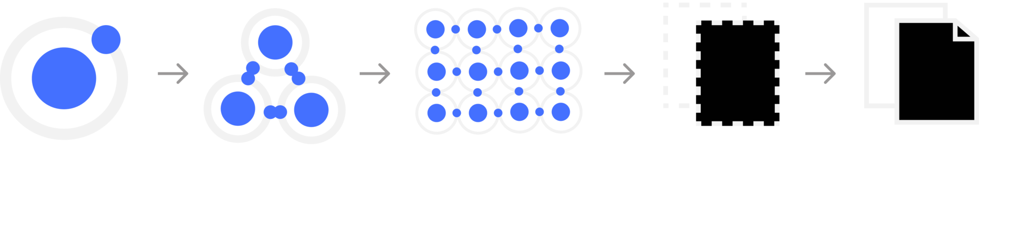
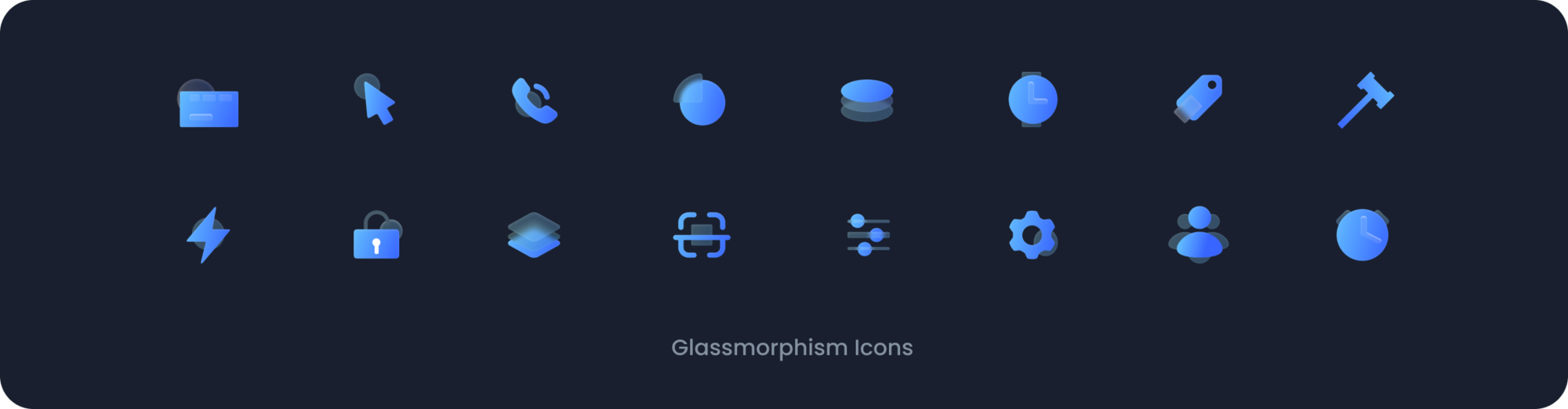
Illustrations
Illustrations help convey complex ideas in a simple way. They should be meaningful and reflect a user's context and emotional state. They help to tell stories and thoughtfully convey ideas - they should not be used as decoration or without consideration
PRINCIPLES
Stay Contextual
Illustration adds information. It provides context, adds clarity, or leads to the next step. It gives users a deeper understanding of what they’re working on.
Have a sharp razor
Keep only the elements that are essential. Each illustration should convey one thing. The story is easy to understand, so users intuitively know how to accomplish whatever they came here to do.
Where to use illustrations?
Onboarding
Onboarding illustrations helps user to understand the steps involved in setting up a new a account and help him visualise the goal that willl be achieved on completing those steps
Empty and Error States
Users see an empty state illustration the first time they access a new part of the experience, before they’ve had the chance to do anything there yet. It introduces what they can do here, and sets expectations for what’s ahead. Should be supported with addition contextual text to make the user aware of the next steps in data visualization, caption is for providing details in places where content is compact and space is tight.

DESIGN COMPONENTS
Components
Components are the reusable building blocks of our design system. Each component meets a specific interaction or UI need, and has been specifically created to work together to create patterns and intuitive user experiences.
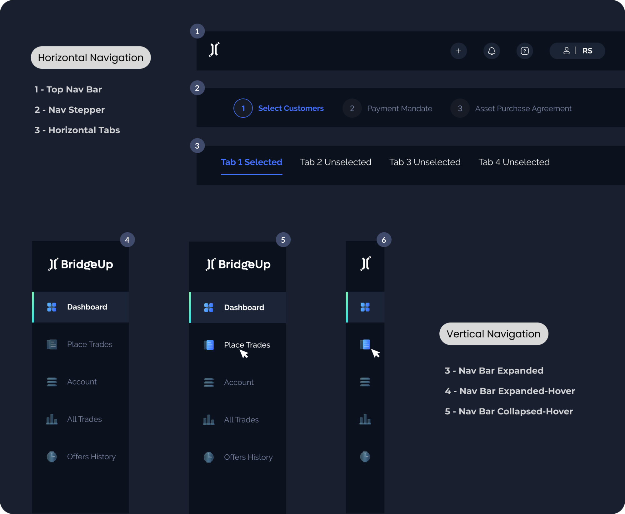
Navigation components
Alerts
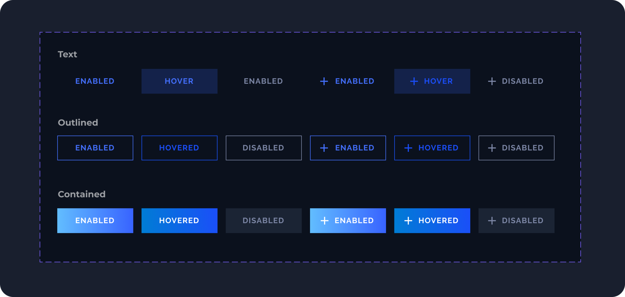
Buttons
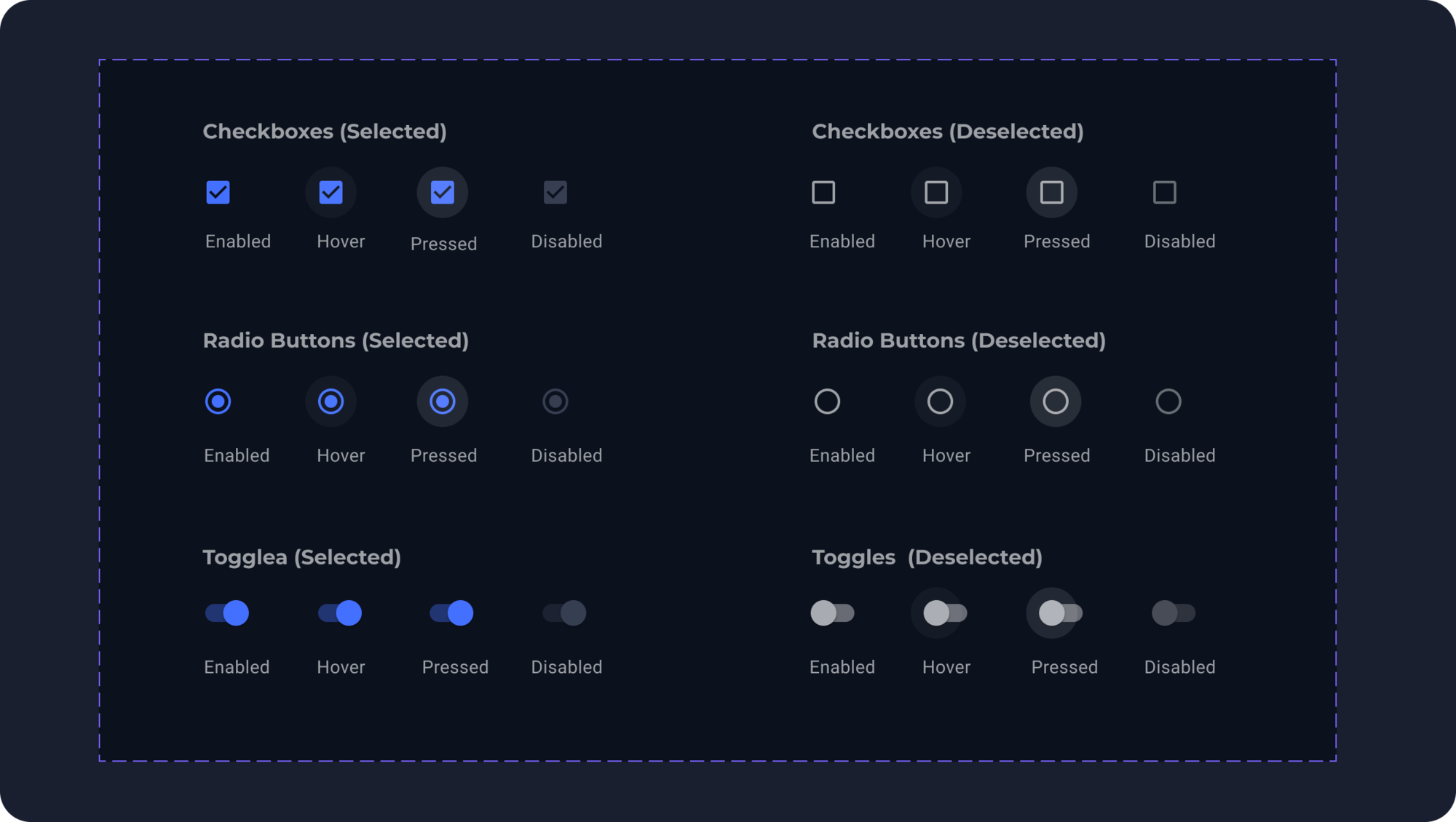
Selection Controls
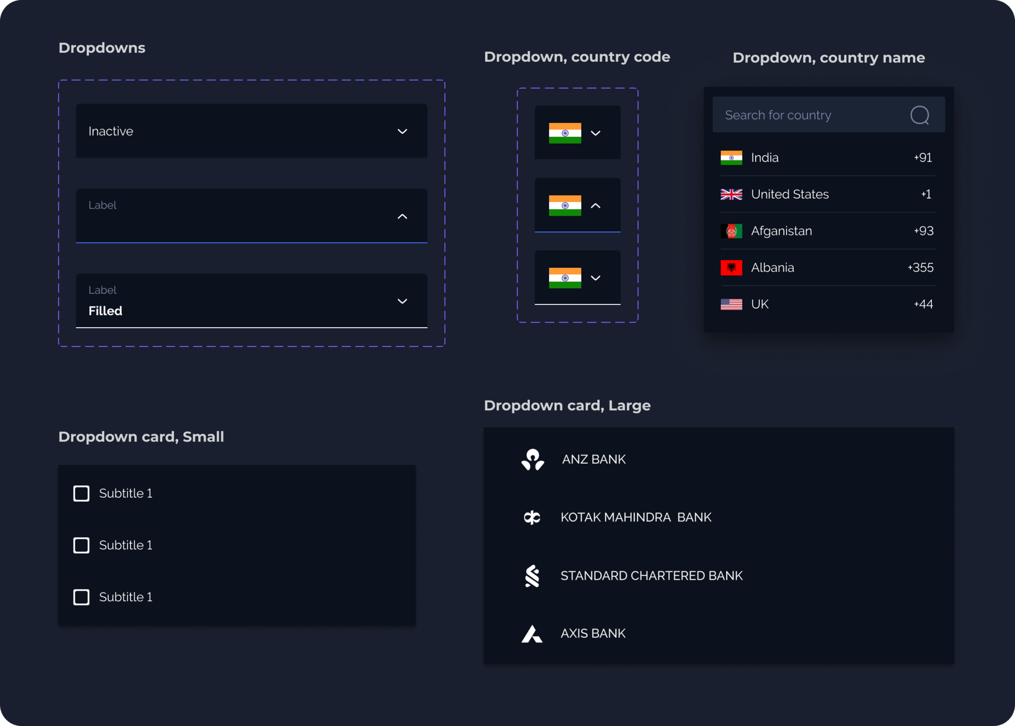
Dropdown Menu
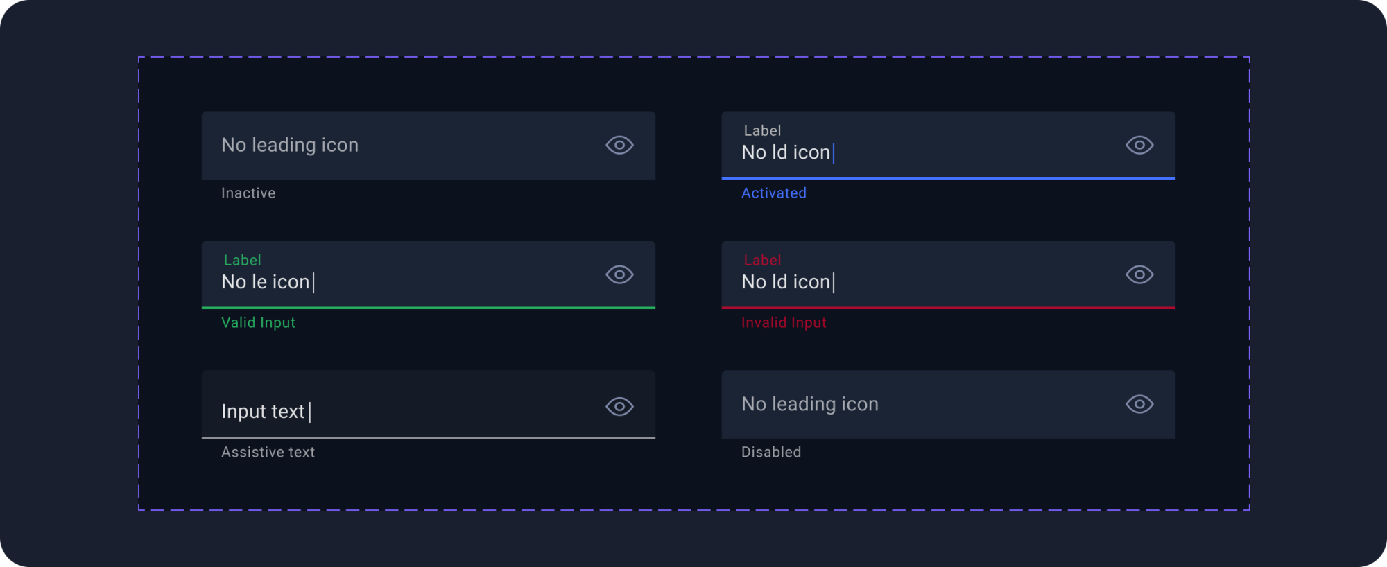
Text Fields
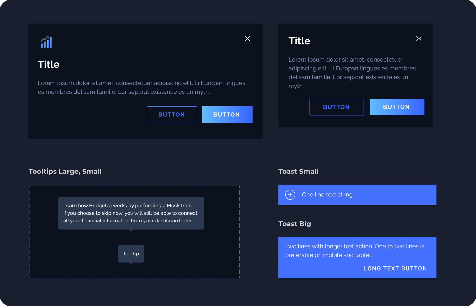
Tooltips and Modals
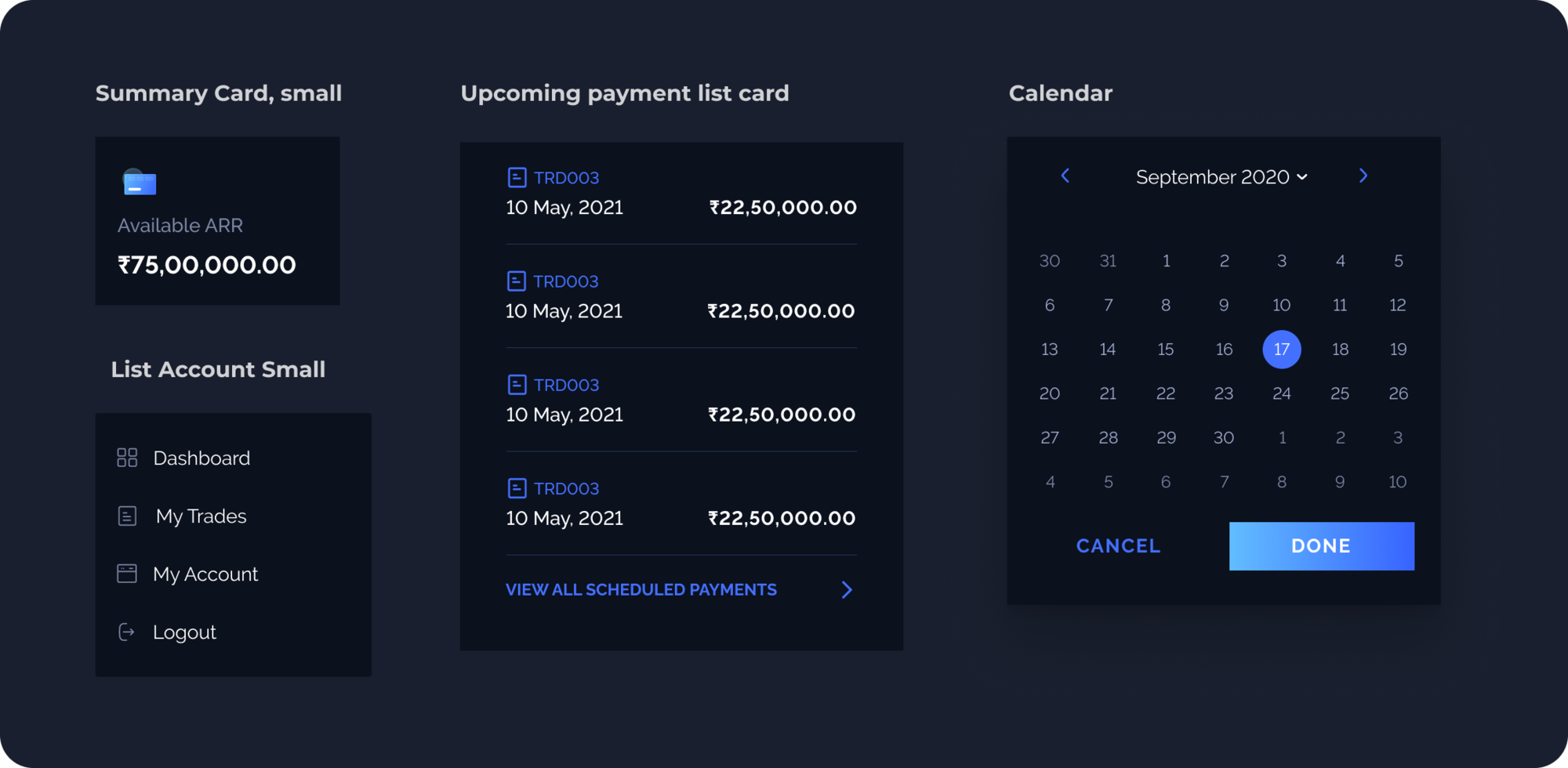
Lists and Calendar
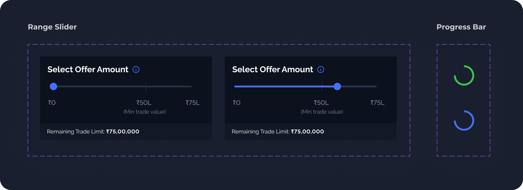
Sliders and Progress Bar
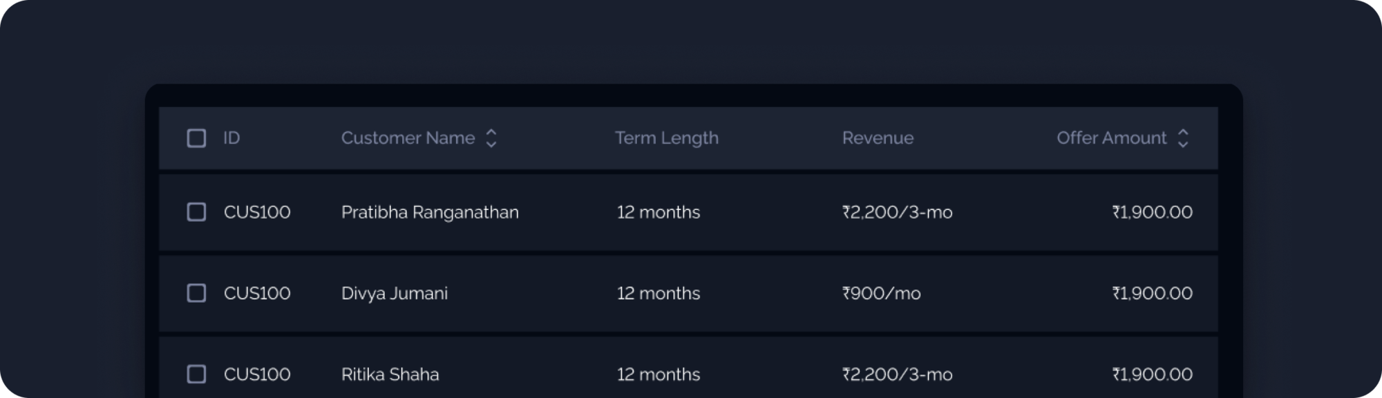
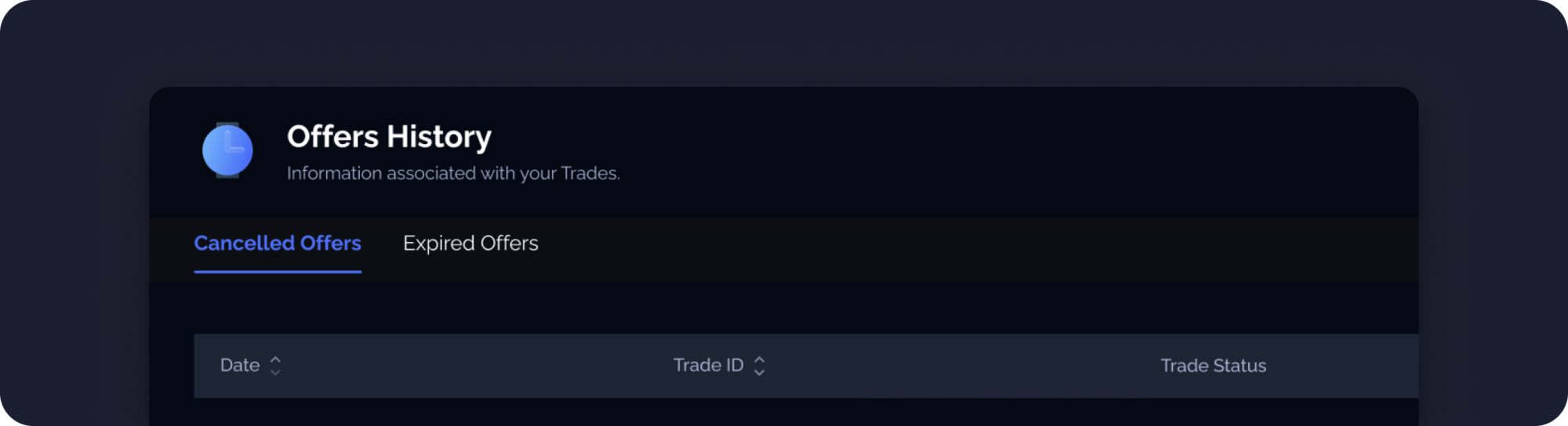
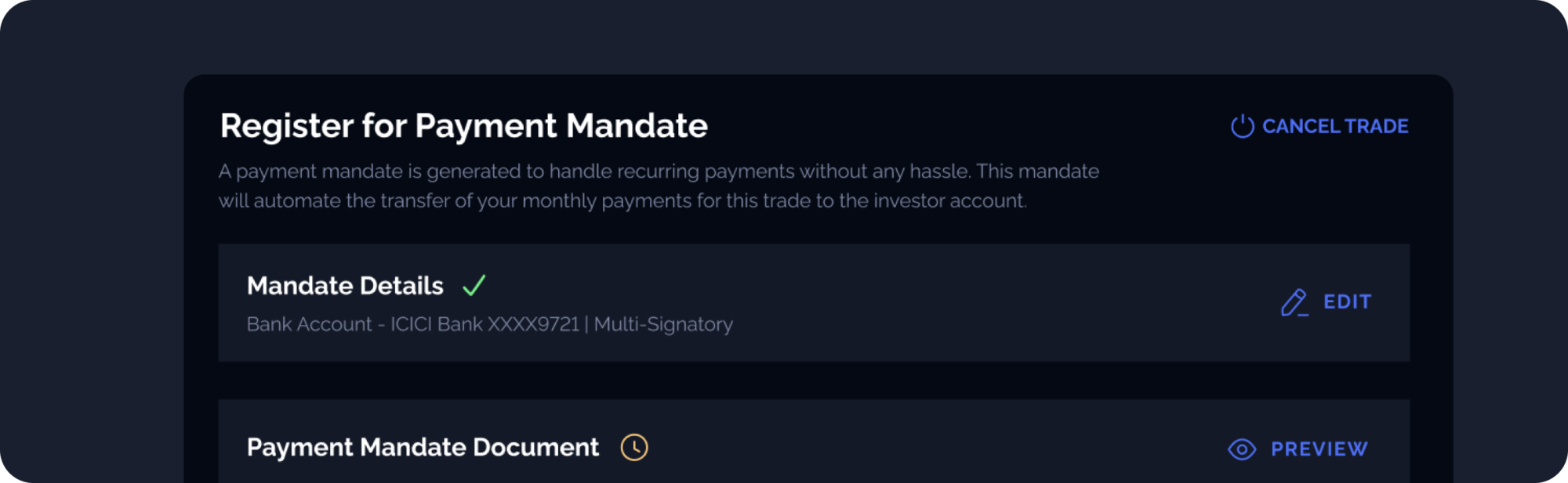
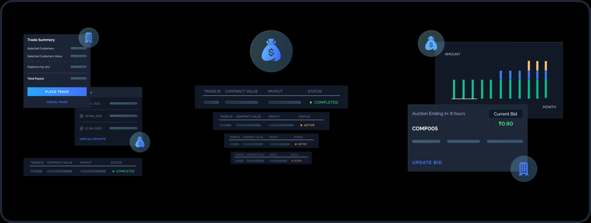
Trade Cards
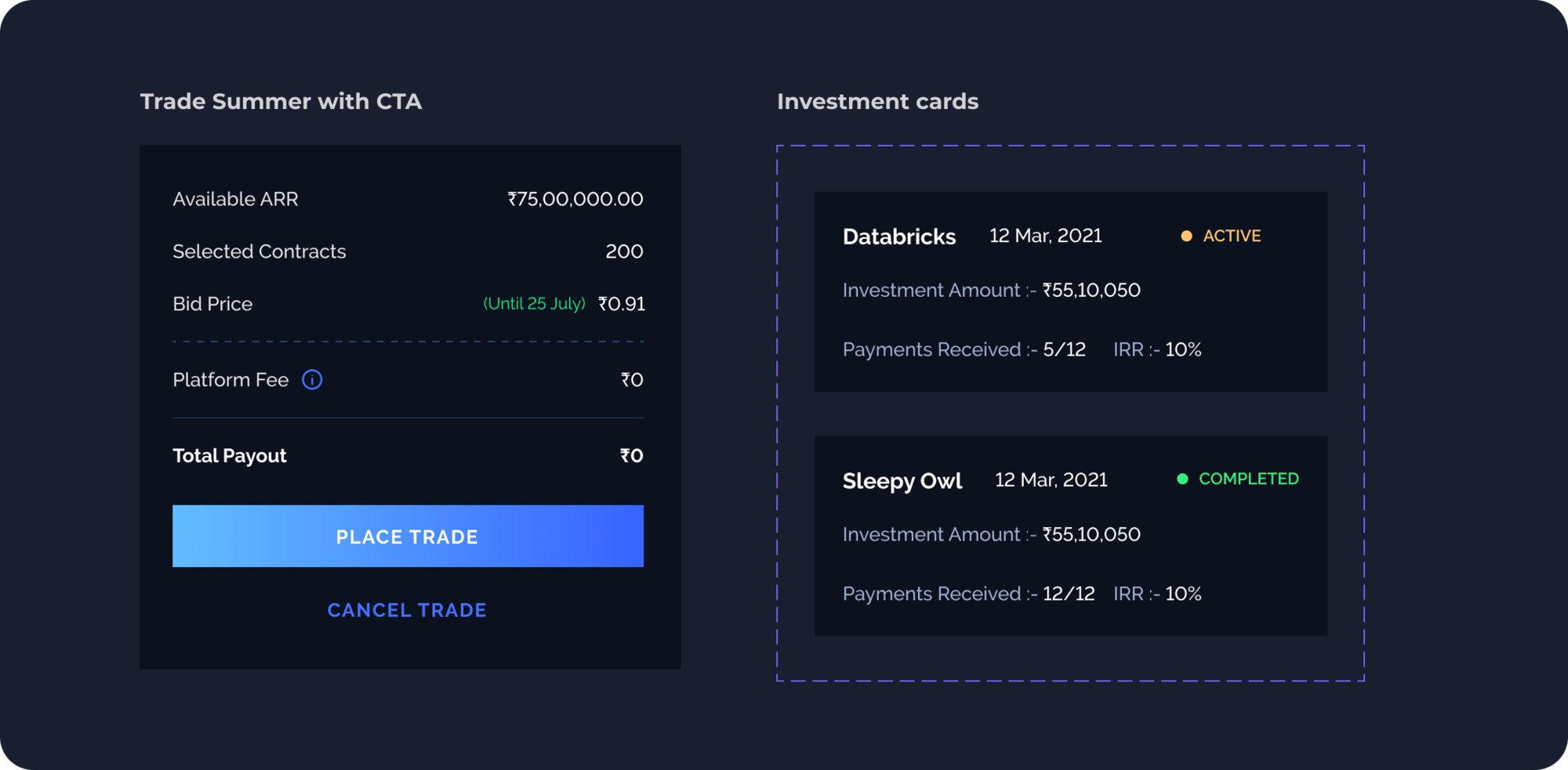
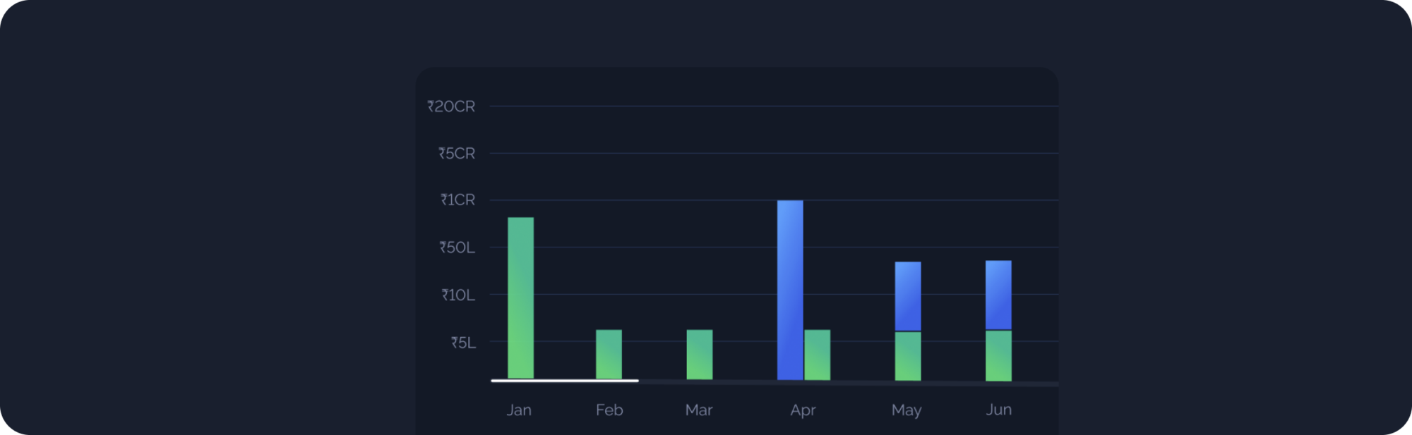
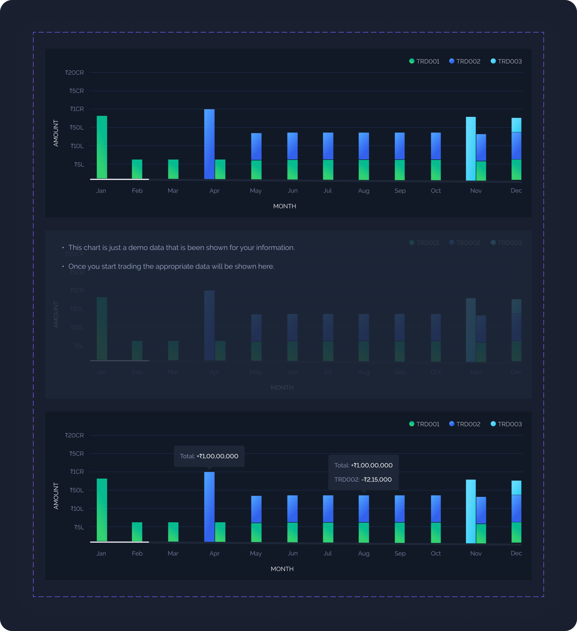
Dashboard Graph
MAINTENANCE
Contribution and Maintenance
When the Bridgeup team designers start designing a new feature, they may come across a component or UX pattern that isn’t defined in the Bridgeup Design System. When that happens, they should reach out to our design system maintainer to make a contribution. The process would look like this -
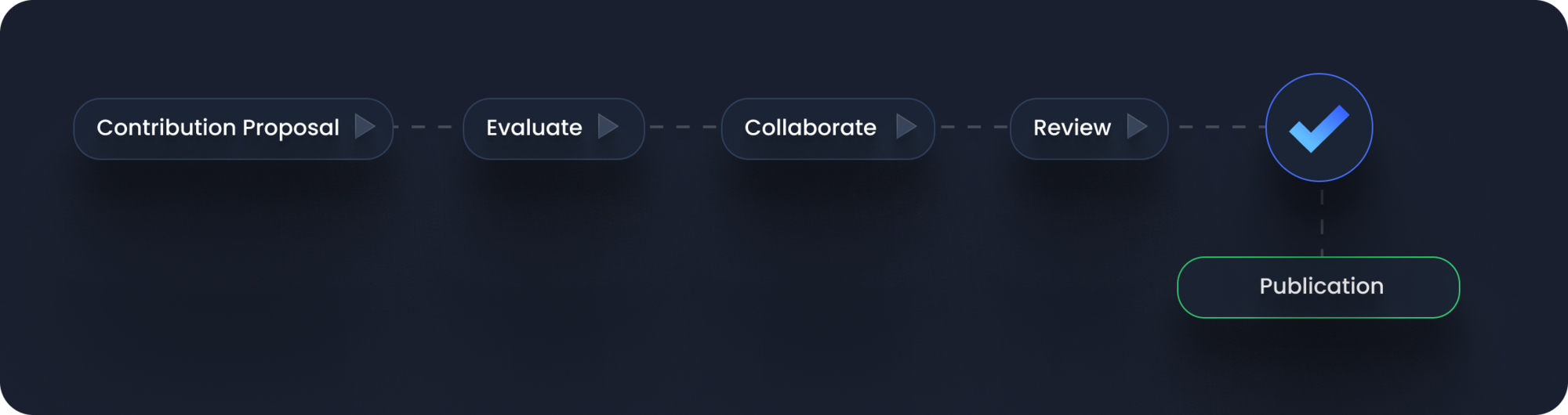
Evaluate the severity and the need of the component
Contributions can be categorized on a scale from small to large, and we can identify meaningful points along that scale:
- A fix of a defect.
- A small enhancement where an architecture otherwise remains stable, such as adding an alert color (orange for “new”) to an existing set (red for “error,” green for “success,” and so on).
- A large enhancement extends an existing feature, such as an alert’s dismissibility, description, and position.
- A new feature is self evident, such as adding a new alert component.
Collaboration
For a simple fix or small change, changes can be directly made to the design system but for medium to large scale enhancements, it’s important to evaluate the associated cost and make sure to involve the right stakeholders. During this phase, designers and developers will go through design iteration until reaching a result they’re satisfied with and then move on to implement the new patterns in the design system codebase.
- Buddy up developers and designers to avoid tech debt down the implementation line.
- Speak a common language and use a consistent naming in design and developer documentation.
- Have a design sign-off checklist that includes accessibility.
- Document all communication (even when face to face) on Jira, to keep stakeholders up to date and the process transparent.
Publication and documentation
Once the changes are published in the system, there still are a few very important things that need to be done. For instance:
- Update the design system documentation portal and design files to make sure that everyone uses the latest documentation and design assets when designing new features.
- Showcase the contribution changes during the design system weekly/monthly demo.
- Communicate with the contribution stakeholders to inform them about the successful outcome of the contribution and to celebrate the effort :)
REFLECTING
It’s a wrap!
Personally as a product designer, developing this design system for Bridgeup was a big responsibility and a learning opportunity for me. I am eternally grateful to the founding team and my product manager for their support and their confidence in my skills. By treating the design system as a product and sharing ownership across teams, we enabled our team to design and build new features faster.
Big shoutout to the entire dev team and our engineering managers for their constant feedback and inputs on the development feasibility of our designs. Thanks guys for making this system come alive!
Thank you so much for giving it a read and let me know if you have any feedback, It would help me a lot