

Job Search made easy with Hadron
Landing Page Design
INTRODUCTION
About this project
Born in 2012, Hadron is a specialized IT recruitment company operating in European market. They partner with top corporates across different Industries and aim to attract best IT professionals in the market, ensuring they are well-evaluated and well-fitted and work on both permanent and contracting opportunities.
Context
Hadron has a large bank of job postings by both companies and recruitment firms. It allows job seekers to register and create a profile and directly apply on the website or app. They decided to do a complete website revamp to improve their experience of job discovery and application to be more competitive in the evolving market.
Role
Product Designer (Me + Product Manager + Design Supervisor(For Feedback))
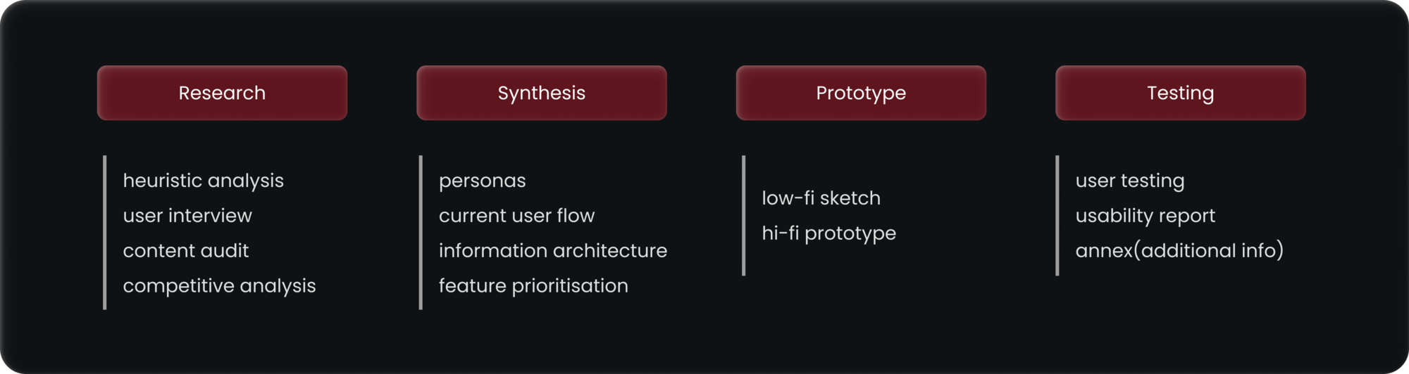
THE PROCESS
Our Methodology
With a time frame of 6 weeks, We broke the UX sprint into research, synthesis, prototype and testing.
MORE RESEARCH
Breaking down issues in the old design
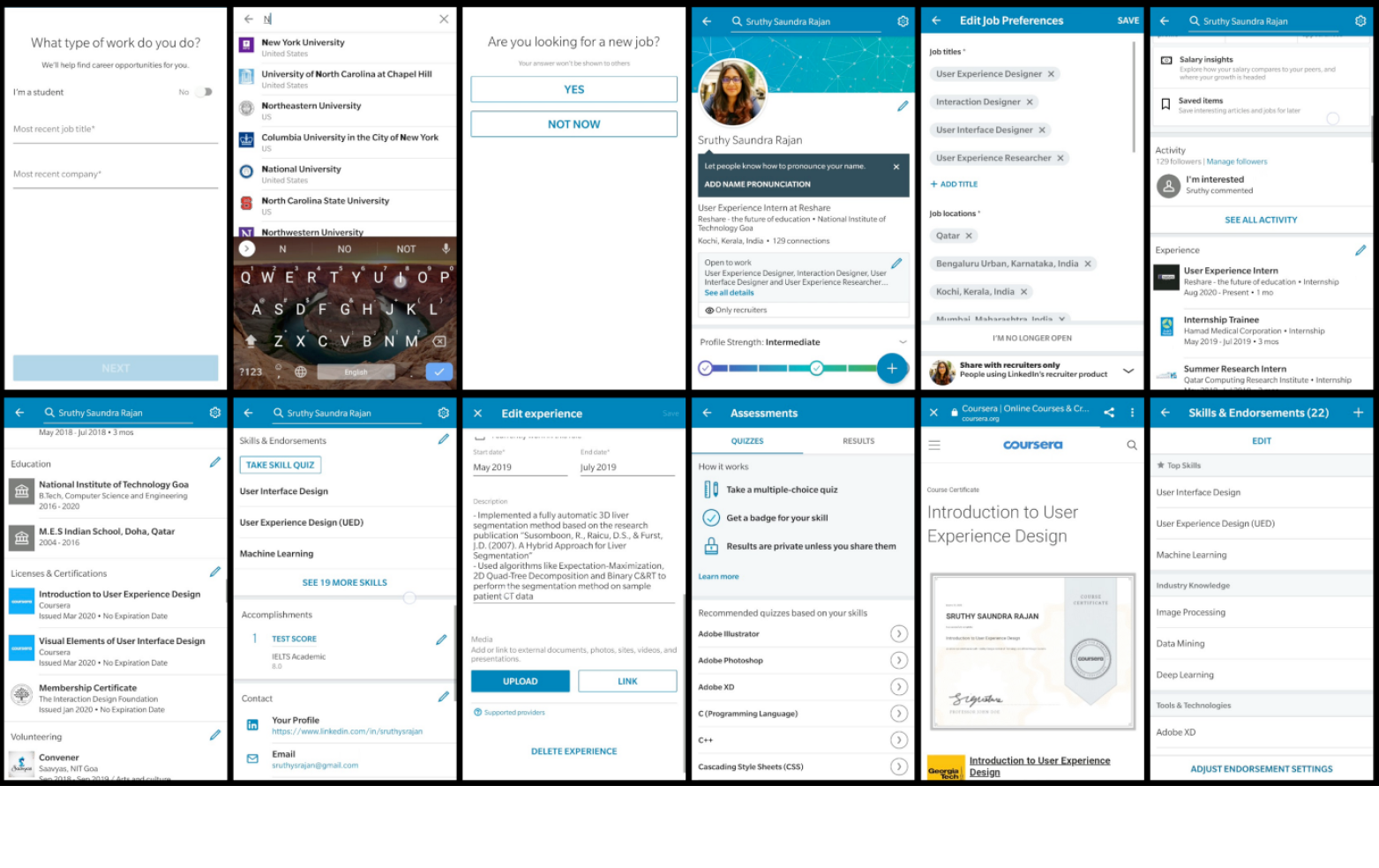
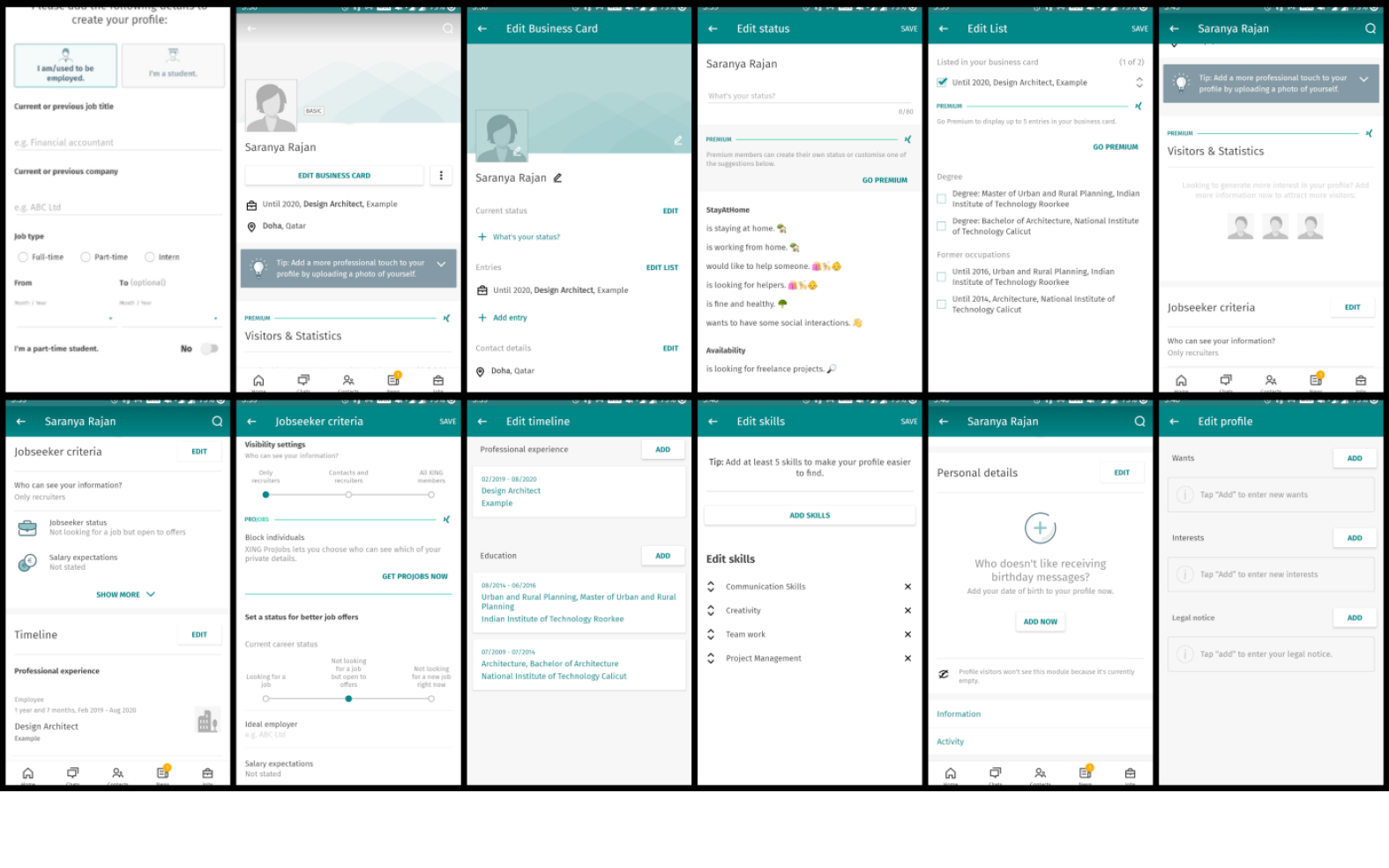
We started with research and took a look at what Hadron currently offers to its users. We wanted to take a deep dive into various features offered by the platform and how do the customers feel about using this platform. So we took the most important screens/features from the platform and did a heuristic evaluation on them.
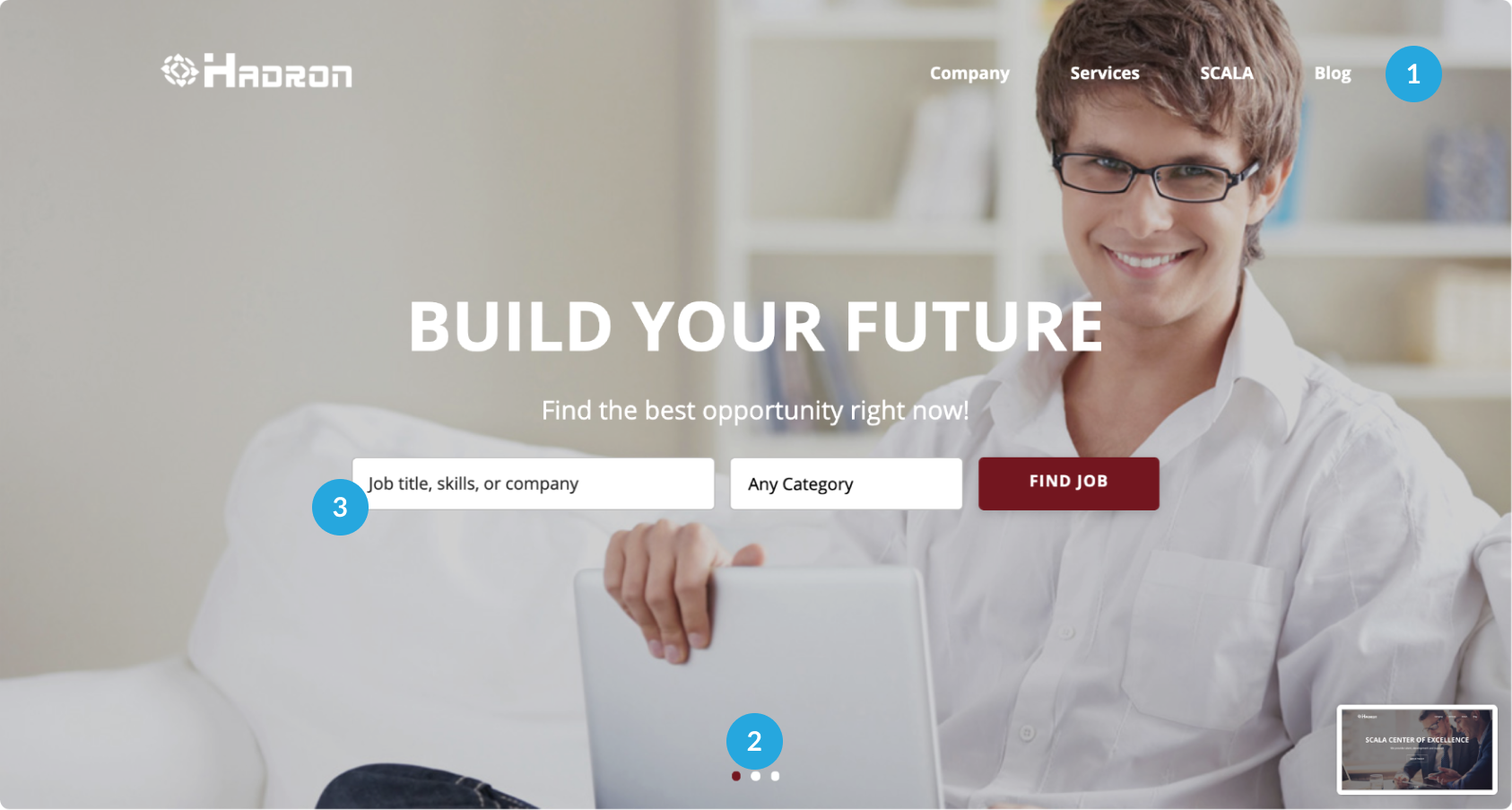
- Mast heads are not communicating the core business strengths
- Putting search in a moving slider, doesn’t give enough focus on search
- Find job section lacks visual icons to grab attention of the user
Overall the hero section is not very elaborate and doesn’t showcase the value it can create for the users. The UI is also not appealing to the target audience of young techies.
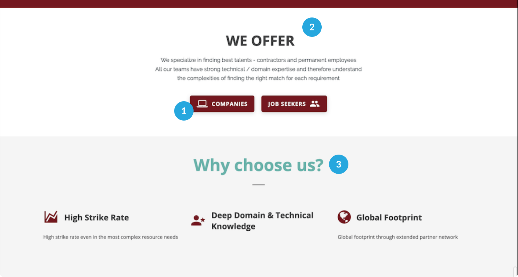
- For companies, Add why they should choose Hadron as recruitment partner - Talk about processes like evaluation, screening and tests
- Credibility builders like Testimonials, Company names, successful projects are missing.
- How Hadron can help section is missing. Also there is no balance of content and imagery.
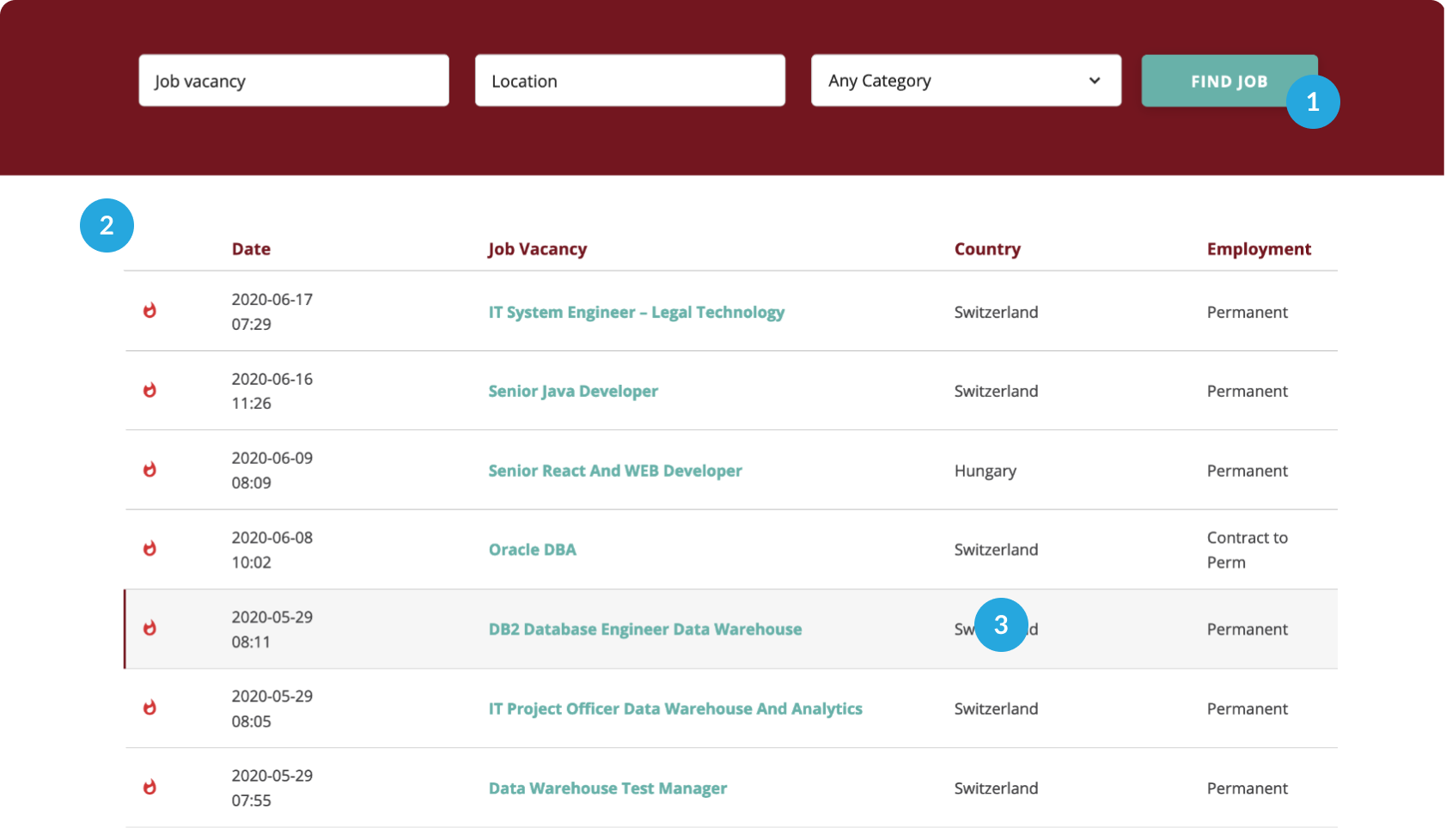
- Search to be extensive including job type, experience, industry, location, job title etc
- Some content talking about services like Resume building, placements, certifications, career counseling, Salary etc
- The entire card is not clickable and only the job vacancy link is, which severely impacts the usability
A career site should do what it can to help reduce the cognitive load on a candidate during the application. If a career site follows predictable, familiar structures and lends itself to recognition rather than recall, candidates are provided with a much more streamlined experience.
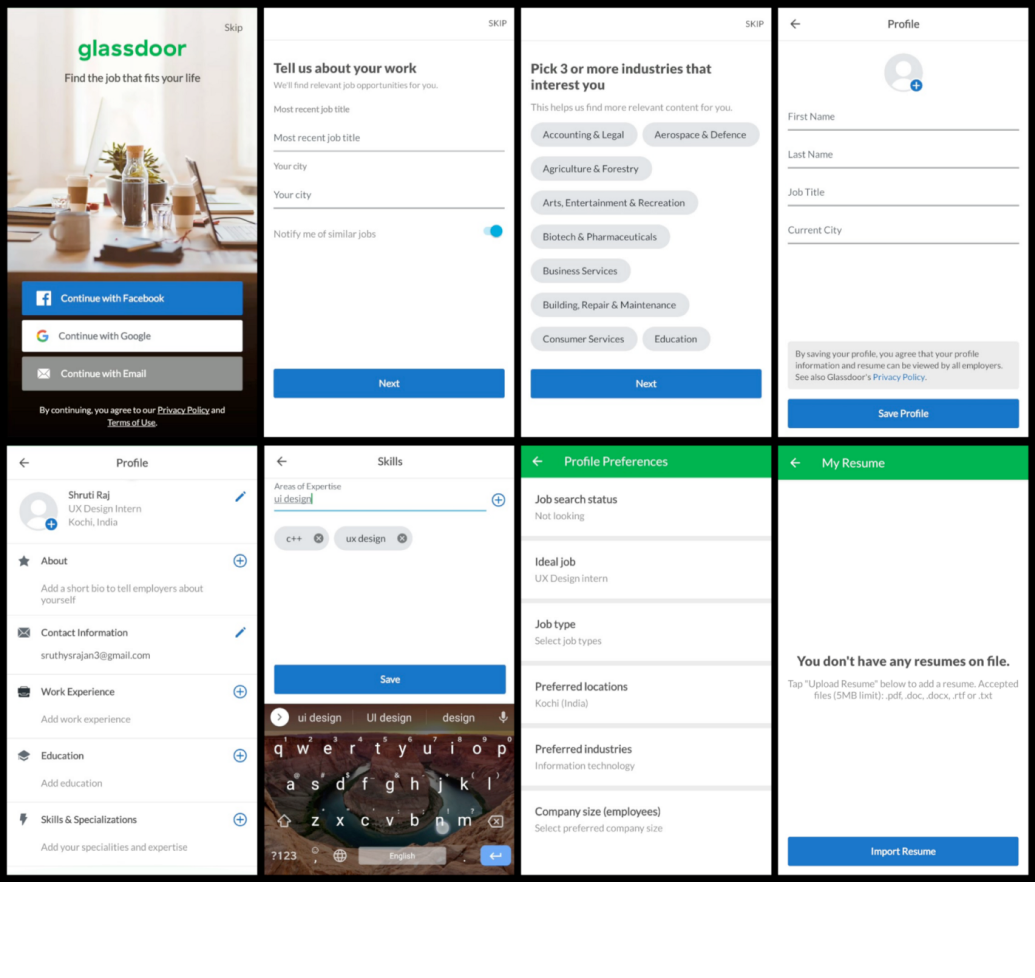
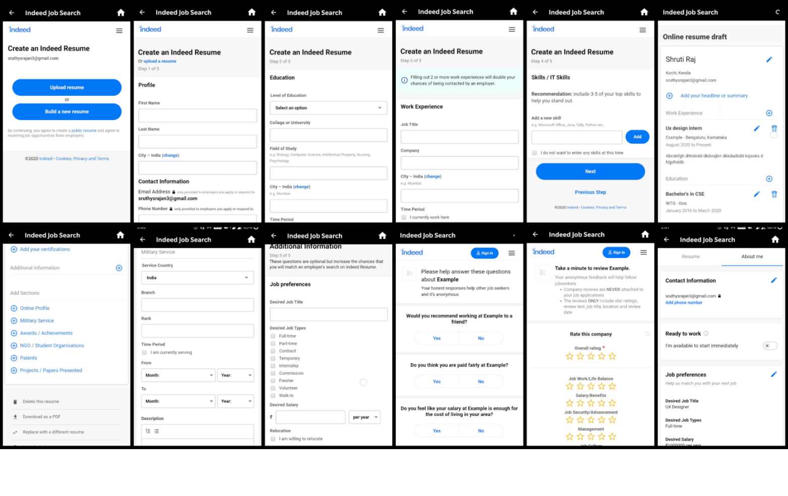
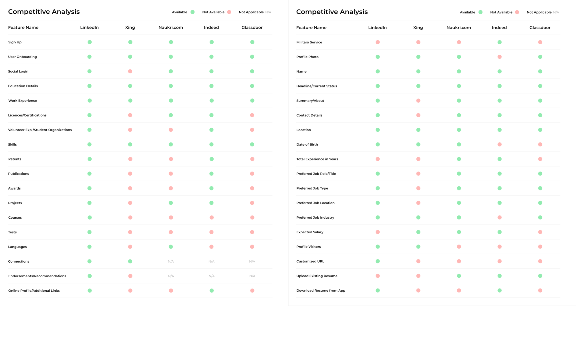
Understanding the competition better
A competitive analysis is a must because it helps understand what works and what doesn’t among features offered by other solution providers in the job portal segment. We also found that hadron features were not at par with the competitors.
THE RESEARCH
UX Solution
After extensive market research and data analysis, we defined actionable opportunities to re-focus Hadron towards a more upscale market. The design language needed to be modern, dynamic, and scalable to set up Hadron for the next step in its hyper-growth. The jobs needed to be more filterable & discoverable. The application process needs to be shorter. An average user should spend much less time looking and applying for a job. Applicant profiles needed to be stronger to increase their chances of getting selected.
A new design needs to be built for Hadron using all the data for simplicity, modularity, discoverability and potential for fast expansion.
Improved content structure
Individual users have different mental models, expecting a familiar UI design that helps them quickly find the information they need. Improving the content structure of the website will result in higher number of job discovery and application

Intuitive Experience
Having intuitive actions is a user-friendly UI, without having to get lost, confused, guessing, experimenting, reading a manual book, or even asking others.
Faster application process
The lengthy application process with more than ten questions is driving the application time up and conversions down. Shortening the application process would mean applicants will be able to apply quickly and apply for more job postings.
USER FLOW AND WIREFRAMES
One of the fundamental problems here was the position and allocation of information, so through our detailed analysis of the competition’s user flows and features we decided to redo all our userflows. A well-designed, user-friendly information architecture ensures that users spend less time and effort searching for information and are successful in finding what they need. Once research and strategy were done it was time for me to start with designing. I started by sketching out some low-fidelity screens.
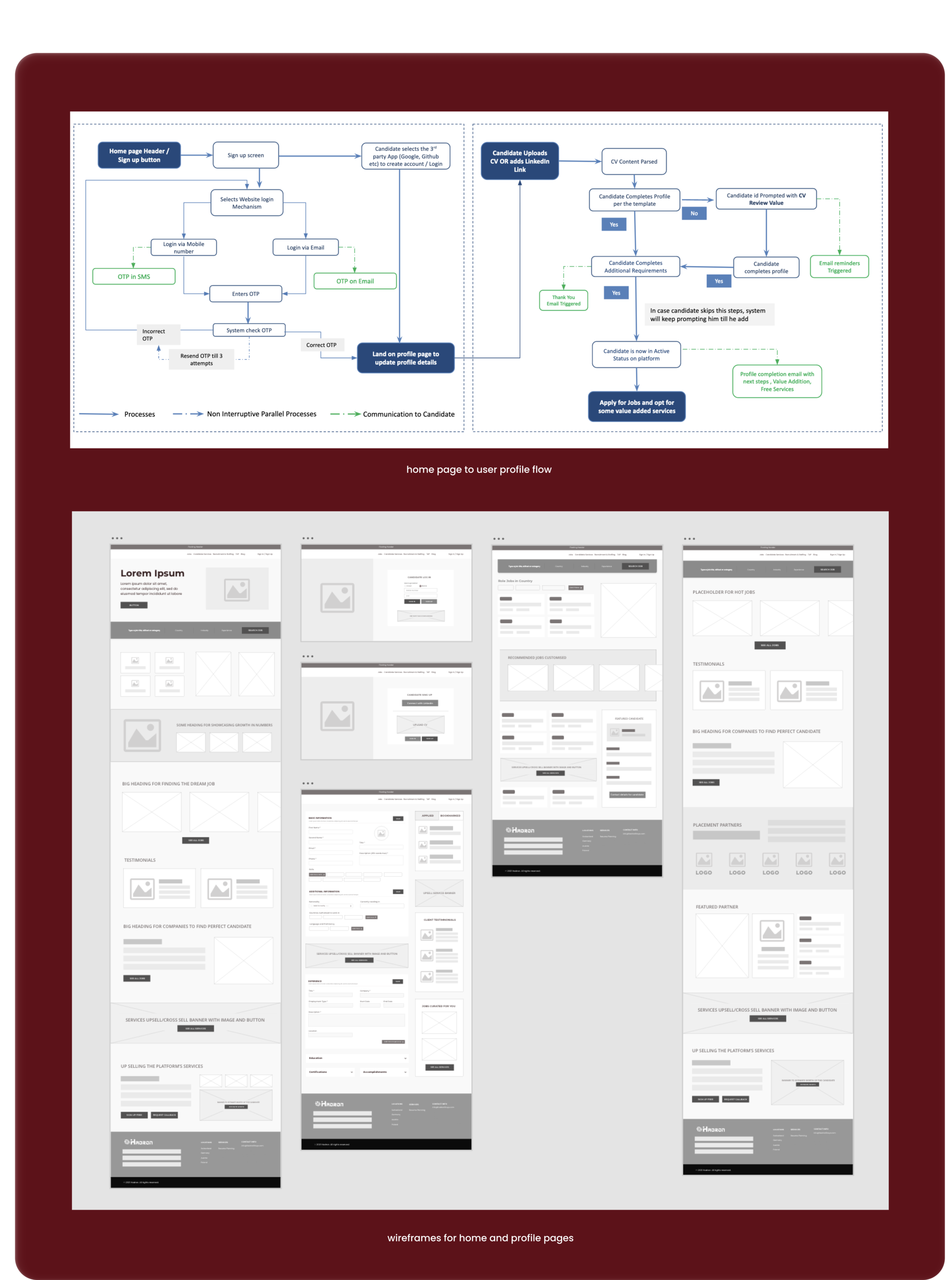
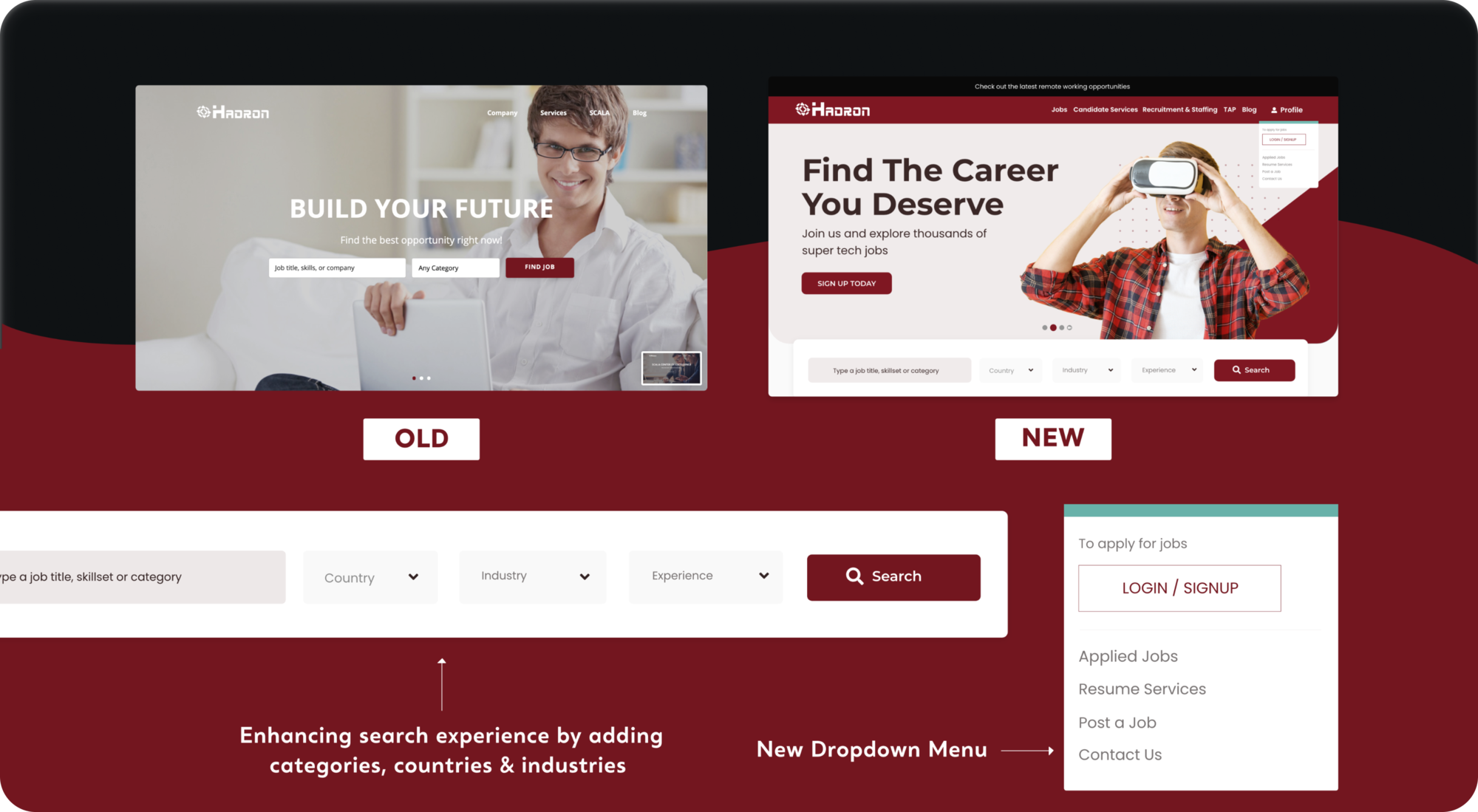
HEADER AND NAVIGATION
The new job search bar was designed in a way to keep the core functionality of the platform, i.e job search, in a sticky bar below the slider. This ensured that even during the promotion of other services, the main service of job search is always in focus. A new drop down bar is also designed to help visitors quickly navigate through the various services of the platform.
HOME PAGE VALUE PROP
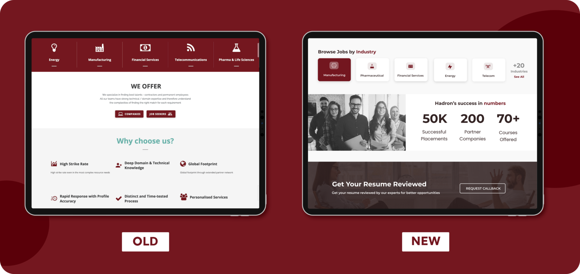
With the new design our focus was to bring in credibility by adding numbers like successful recruitments, projects completed, no of compies worked with, countries we have presence in to solidify the trust of our visitors. The new design also promotes the value added services provided by the company via a home page banner
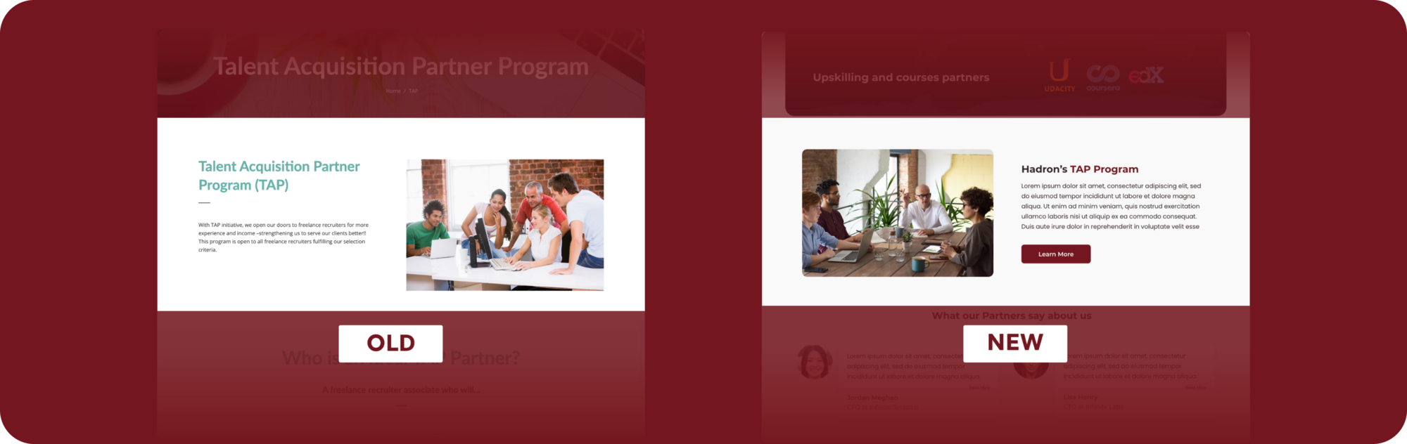
JOBS LANDING PAGE
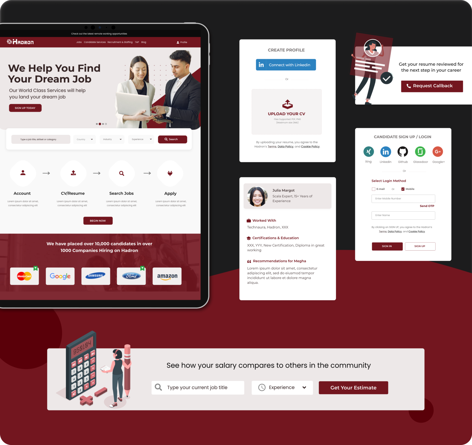
A dedicated job landing page is added to the new version to provide a better overview of how the platform works and how they differentiate from others in the market. We have added stats and testimonials on successful placements. Some text highlighting key differentiators and services are also added with a new section to display partner companies logo. The signup process is simplified for a great customer experience. User can simply upload their LinkedIn profile and the profile page is automatically populated from the parsed content.
PROFILE UPDATE PAGE
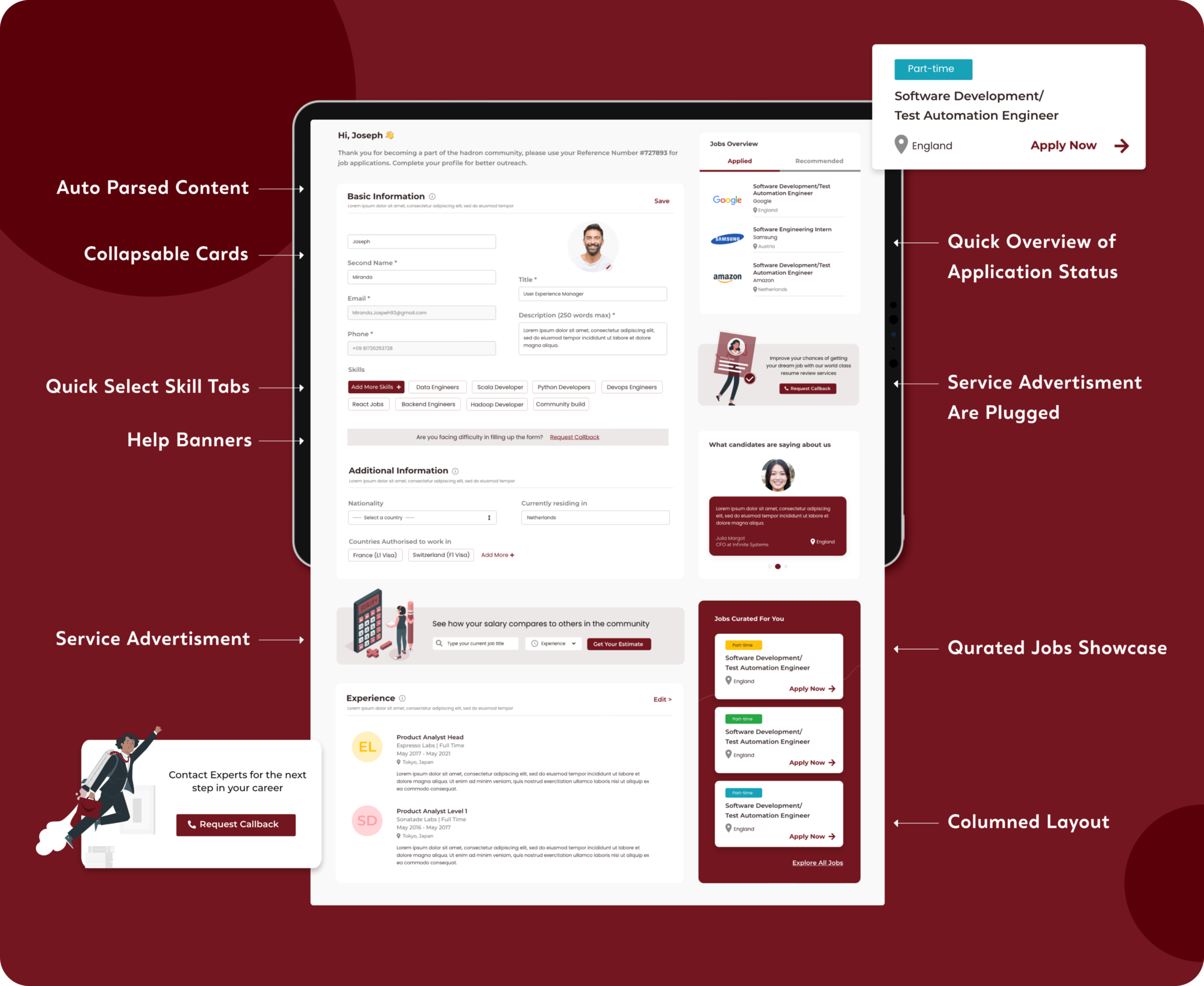
If the user connects their linkedIn profile or upload their resume onto the platform, the user profile page is designed to parse relevant content and auto fill various fields in the profile page. Additionally, there’s also a provision for the user to add more content. Additional services are plugged in between some sections for better customer engagement. User can also have a quick overview of status of their applications and can also apply in the recommended jobs.
CORPORATE SERVICE
The company also provides staffing and recruitment services to corporate. So the new design comprises of changed imagery to align with corporate styling, is more infographical and the narrative is more focussed on the company’s strengths. The brand colours are made consistent across all sections and a CTA has also been introduced for better conversions.
REFLECTING
IT'S A WRAP
This project helped me to get a deeper understanding of user motivations, behaviour, needs and goals. Going ahead we would do usability testing to test our improved layouts and also set key metrics to measure the success of the revamp.
Thank you so much for giving it a read and let me know if you have any feedback, It would really help me a lot. You can also check out the live website this link
Big shoutout to the entire product team for their constant feedback and inputs on the design and to the dev team for making design come live with their wonderful coding skills!
