

Product Conference
Landing Page
Landing Page Design
INTRODUCTION
About this project
The Product Folks is a volunteer-driven community of Product Managers and enthusiasts. Popularly known as TPF, the community has over 65K members and have conducted over 200+ events both offline and online.
Context
The community saw a huge surge in their followers post pandemic and they were gearing up for their biggest virtual event of the year. I was responsible for creating a landing page for this upcoming event which was going to be used by the team for getting corporate sponsorships and also new sign-ups for the event.
Role
Product Designer
THE PROCESS
Explore/Research
With a time frame of 6 weeks, We broke the UX sprint into research, synthesis, prototype and testing.
I did thorough research and competitive analysis. Found plenty of websites that host product events virtually.
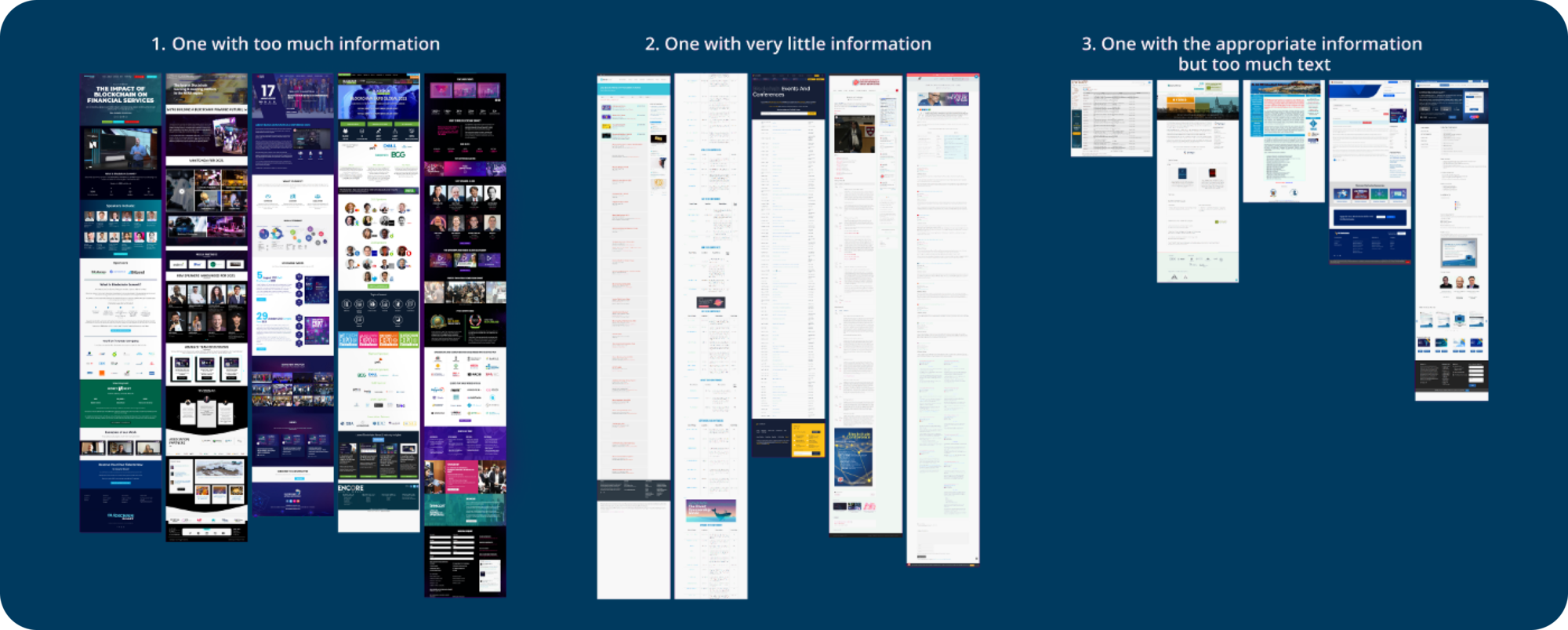
After analysis, I could easily figure out and C.A.T.E.G.O.R.I.Z.E websites.
- “One with too much information” — These are the only website that actually looked like a landing page but had too much information. Most of the information was repetitive or irrelevant.
- “One with very little information” — These were the websites whose landing page was basically a calendar to follow throughout the year.
- “One with the appropriate information but too much text” — These websites seemed correct but somewhere lacked good design.
MORE RESEARCH
Visual Language
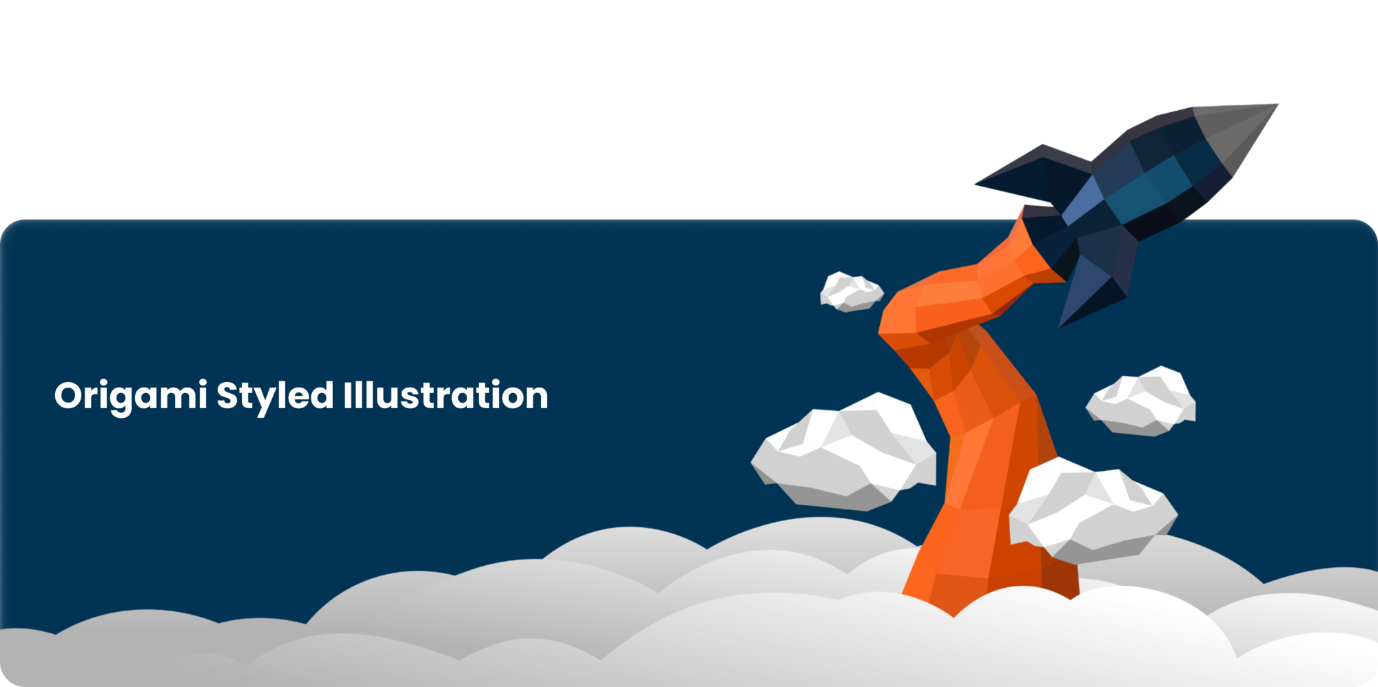
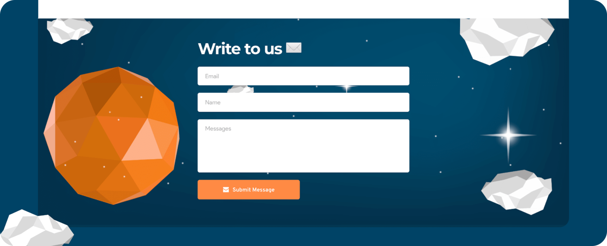
To make the hero section a show stopper, I decided to design some customised illustrations for the landing page. Since the logo of the community has a rocket, so I decided to give a style twist to the rocket and add more scenery like clouds and meteors around it. Origami or Paper Mache which gives a handmade 3D effect to the layout. This is specially relevant to the nature of the conference where the attendees are big on innovation.
THE SOLUTION
Hero and Navigation
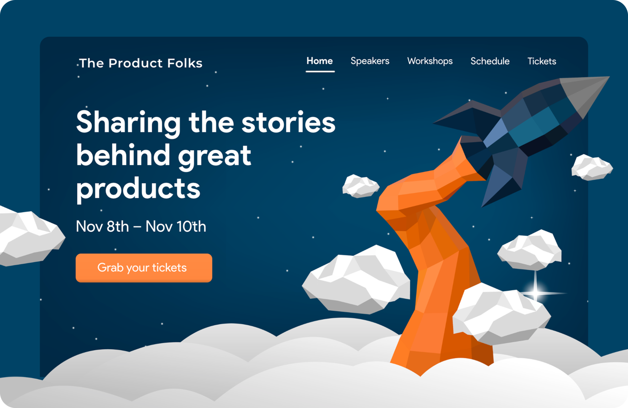
The basics behind the Hero section was to keep it
- Simple, skimmable, and uncluttered
- Interesting but serious/important
- Provide relevant information only, and not confuse the user by attacking the eye through clutter and mess of pictures and content
- Display some eye catching illustrations that set the theme of website and event
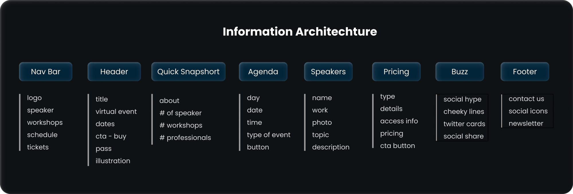
Why did I choose these specific sections for the navigation bar?
Navigation bar to contain minimal and most commonly used Menus for an event-based website. Including —
1. “About”- coz why not, it’s an event-oriented community who probably have more events coming up and also have information of past events.
2. “Speakers”- Attendees want to quickly navigate to a section where they can check out details of speakers
3. “Schedule”- gives a sneak peak into the event and excites the user to signup
4. “Tickets”- gotta talk about the price of the passes that users are looking for. Also indirectly works as a “Buy Pass” CTA.
Header’s main job is to grab attention. Keeping it loud and clear of what’s going to happen soon i.e. a “Product Conference”, shutting out any scope of confusion.Value position has the context about the event dates and type with a short description about the event, teasing the user to make them scroll down and know more. CTA to finish the section with to buy passes, adding the contrasting orange gradient to the dark theme to make it stand out.
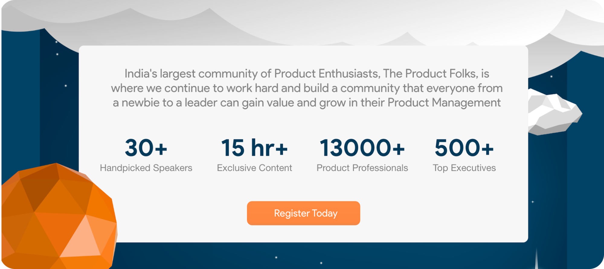
About and Highlight
Without overcrowding the hero section, I shifted the about section to the bottom of hero. This section gives additional details about the community along with some highlighted texts that showcases the magnitude and scale of the event being conducted. There is another CTA, at the bottom of the highlighted text to increase conversions.
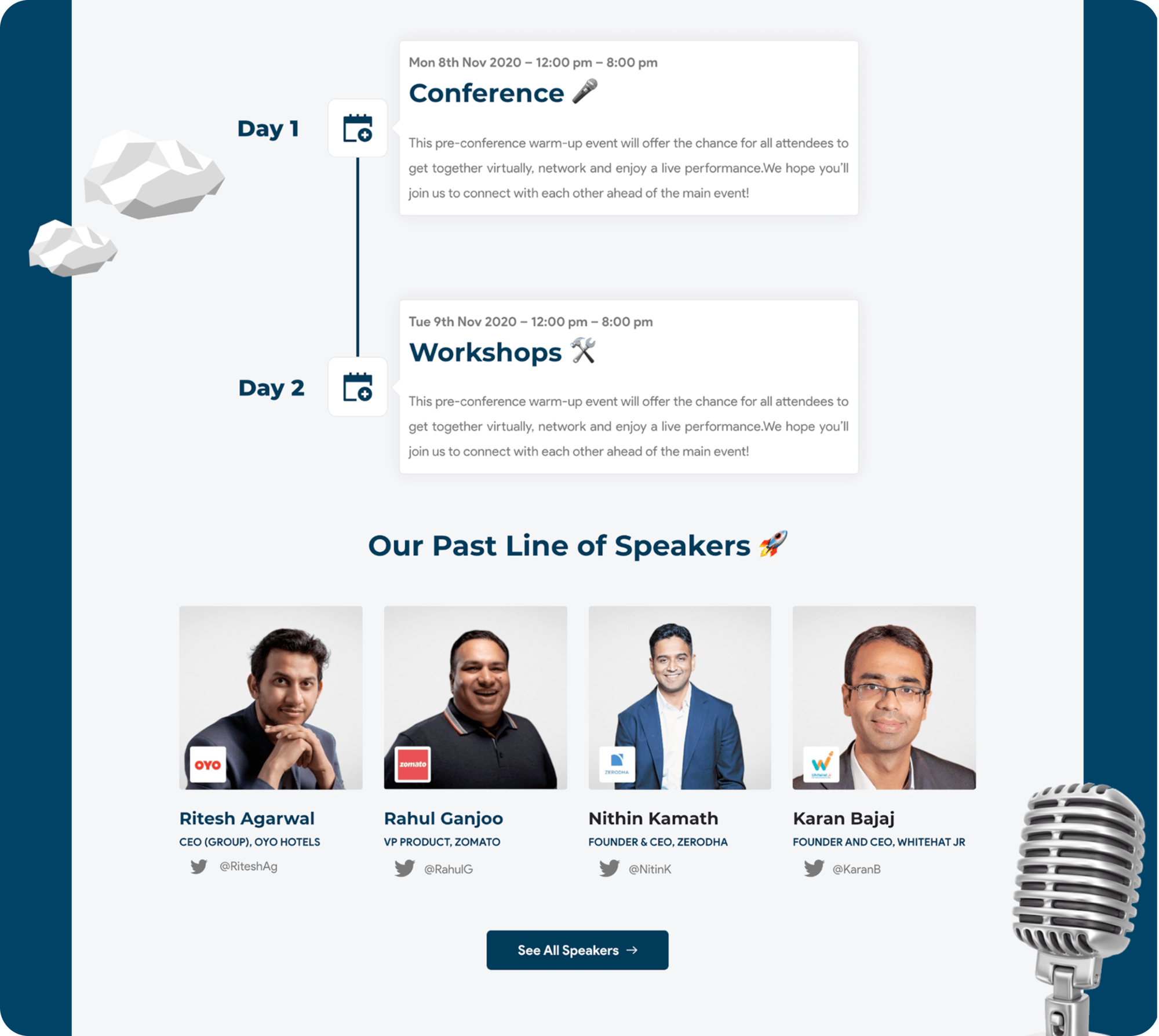
Agenda and Speakers
Agenda section is simple timeline view with clean cards and relevant emojis for quick refrence. For the speaker section, I wanted to design the cards in such a way that it answers the following questions.
Who are the speakers? — Card showing their name and picture
What do the speakers do? — Displaying current title speakers holds with the name of the organization that they are working for.
How do people connect to these speakers before event? — The most commonly used social handle of the speaker
Below I have also provided a CTA for the users to checkout all speakers from the virtual event.
For the mobile version of the section, the cards are the same as the website but are horizontally place to save space on the web and it’s to swipe to right via mobile.
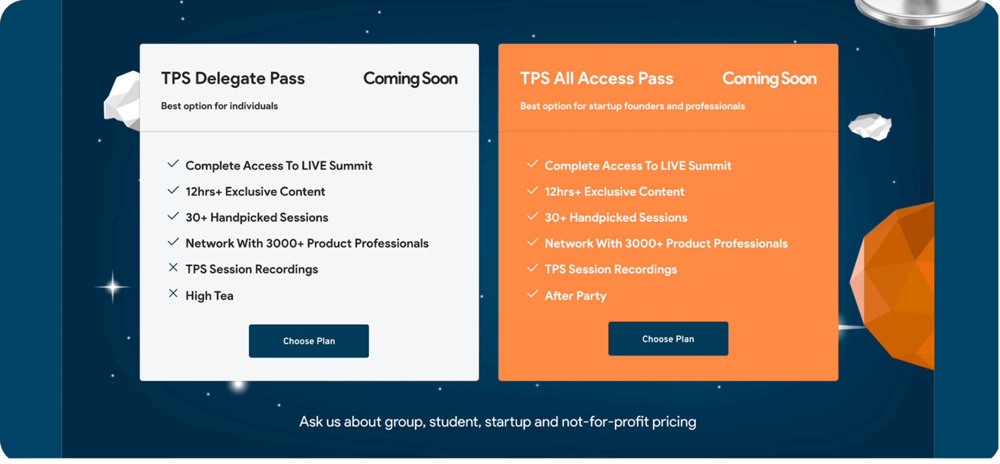
Ticket
Just below the speaker section is the ticket section which is designed to incorporate multiple type of tickets and the UI has contrasting cards for diverting the user’s attention to the most value pass. The community decided to not display the prices upfront on the ticket and instead only direct the user to the relevant ticket booking page from a third party vendor.
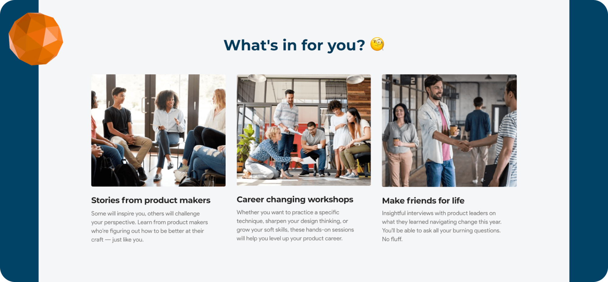
What’s in it for the attendee?
This is an important section as the user has already passed the ticket section and maybe is still a little unsure about the event so this section is designed to help the user visualise the energy of an offline event which will be replicated in the virtual event as well. The tone of the content and imagery is very friendly and is targeted for an young audience,
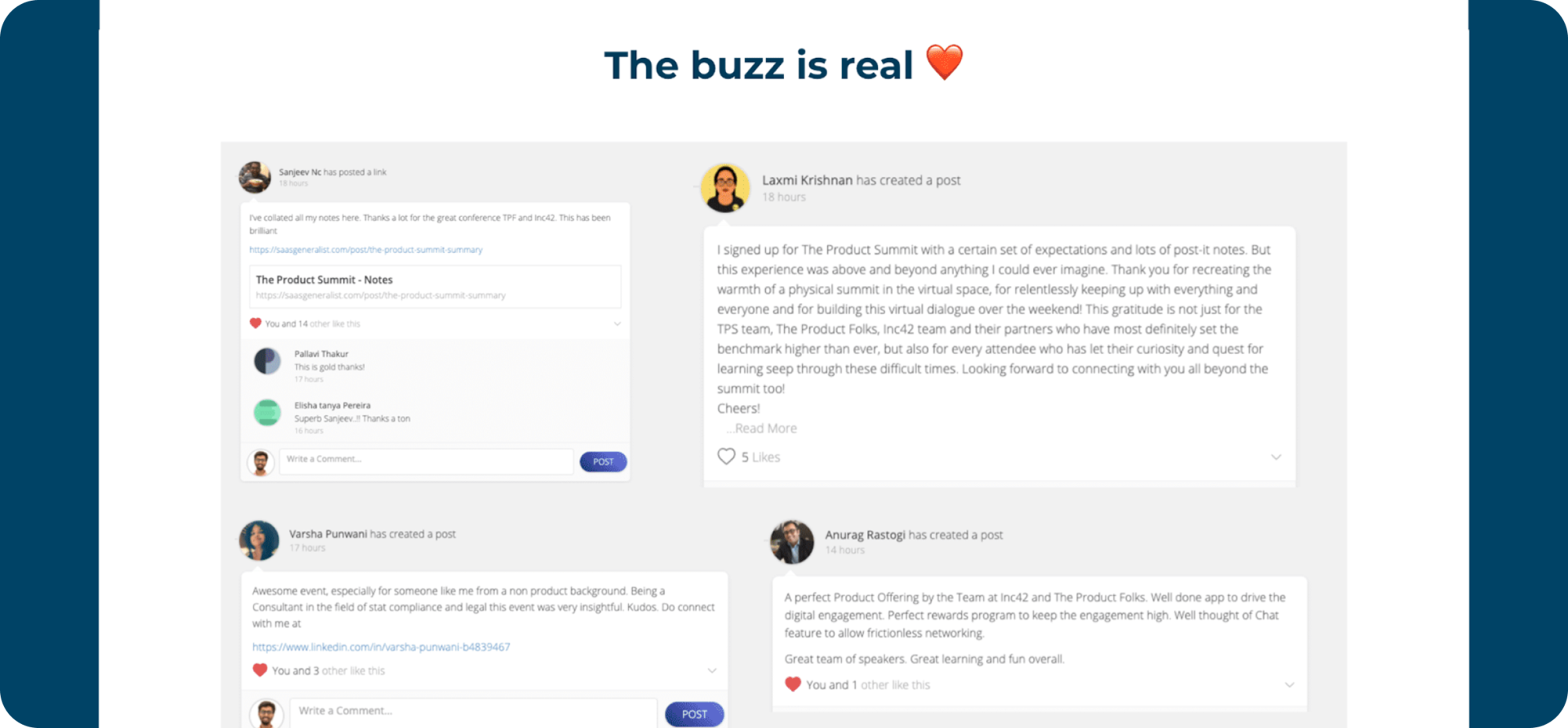
Creating some buzz
Is it even a product conference, if some legendary product leaders are not tweeting about the event? No, right!
So this section was a must have, The design is very minimal in a masonry grid format to show some details about the person who tweeted and their tweet.
Contact us
The bottom navigation and contact us form had a lot of visual elements from our custom designed origami theme with a simple CTA to send a message to the organising team.
REFLECTING
It’s a wrap!
Thank you so much for giving it a read and let me know if you have any feedback, It would really help me a lot. You can also check out the complete design on Behance through this link
Big shoutout to the entire team at TPF for their constant feedback and inputs on the design and to the dev team for making my design come live with their wonderful coding skills!
And if you are a product-enthusiast, then you should definitly check out The Product Folks, it’s a volunteer-driven community of Product Managers and enthusiasts who are passionate about making an impact and help everyone grow together. They have a very supportive team of voluteers and always have some interesting event lined up!